

About Creattion Demo Font
I came across Creattion Demo Font while searching for a soft, romantic script for a small branding refresh. A client wanted something gentle, but not childish, for a handmade gift shop. The font preview caught my eye because it looked smooth, flowing, and a bit dreamy without feeling messy.
I decided to test it in a real layout, using it for logo sketches, thank-you cards, and simple Instagram posts. On Free Fonts Lab, I often try scripts to see how they behave in print and on screen. This one felt worth a closer look, especially for projects that need a warm personal tone.
Font Style & Design Analysis
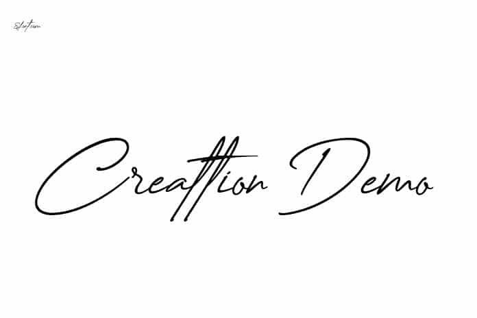
Creattion Demo Font is a script typeface with a modern, flowing brush look. The strokes are smooth and joined, so words feel like real handwriting. It leans slightly to the right, which adds movement and rhythm. The thick and thin strokes create a gentle contrast that keeps the letters readable while still looking stylish and decorative.
The designer is not clearly credited in the files or common sources, so I have to note “designer unknown” here. That lack of clear authorship makes it harder to trace the full font family or history. Still, the work itself feels polished enough for a demo, with consistent shapes and a clear design direction that fits the modern script category very well.
The letterforms have wide, open counters and soft curves, which give a friendly and romantic mood. Capitals are quite showy, with long entry strokes that work well for initials in names. Spacing is fairly tight, as you would expect from a script font, so long words can look dense if you set them too small. It shines in short phrases and logos, but struggles in long text blocks or at tiny sizes.
Where Can You Use Creattion Demo Font?
I found Creattion Demo Font most effective in branding for boutiques, wedding stationery, and beauty products. It works nicely for logo marks, gift tags, and headline text on packaging. At larger sizes, the brush detail and smooth curves feel elegant and clean, which helps when you want a soft but confident visual identity.
On social media graphics, it handles quotes, names, and short titles well, especially over soft backgrounds. I would avoid using it for small captions, long paragraphs, or UI labels, because the connected script shapes can become hard to read. Pairing it with a simple sans-serif for body text creates a clear hierarchy and keeps layouts balanced and calm.
For print work, I would use this script in invitations, save-the-date cards, thank-you notes, and personal stationery. It also fits lifestyle blogs, fashion lookbooks, and handmade product labels. Just keep it for key words or short lines. Let another clean typeface handle the supporting copy so the script style remains special instead of overwhelming the whole design.
Font License
Creattion Demo Font is shared as a demo, so I treat it as limited use by default. Demo licences often allow personal or testing work, but may restrict commercial projects. Because terms can change, I always recommend checking the official licence and source before using it in any paid or public client work.
My honest takeaway as Ayan Farabi: this font is a lovely option for soft, short display work, as long as you respect its limits and confirm the licence before serious use.


Leave a Reply