

About Crimson Text Font
I first reached for Crimson Text Font while working on a book layout that needed a calm, literary voice. The project called for a classic look, but I did not want something stiff or overused. I wanted a serif that felt like real ink on paper, not a digital cliché.
As I tested different options for that long-form reading project, Crimson Text Font stood out for its warmth and balance. It carried a traditional mood without feeling heavy or slow. I later wrote about my experience with it for Free Fonts Lab, because it behaved better than I expected in real print and screen layouts.
Font Style & Design Analysis
Crimson Text Font is a serif typeface clearly inspired by old-style book typography. The letterforms have soft contrast, gentle curves, and slightly old-world details that recall classic literature. It feels like something you might see in a well-loved novel, yet the shapes stay clean enough for modern publishing and digital reading.
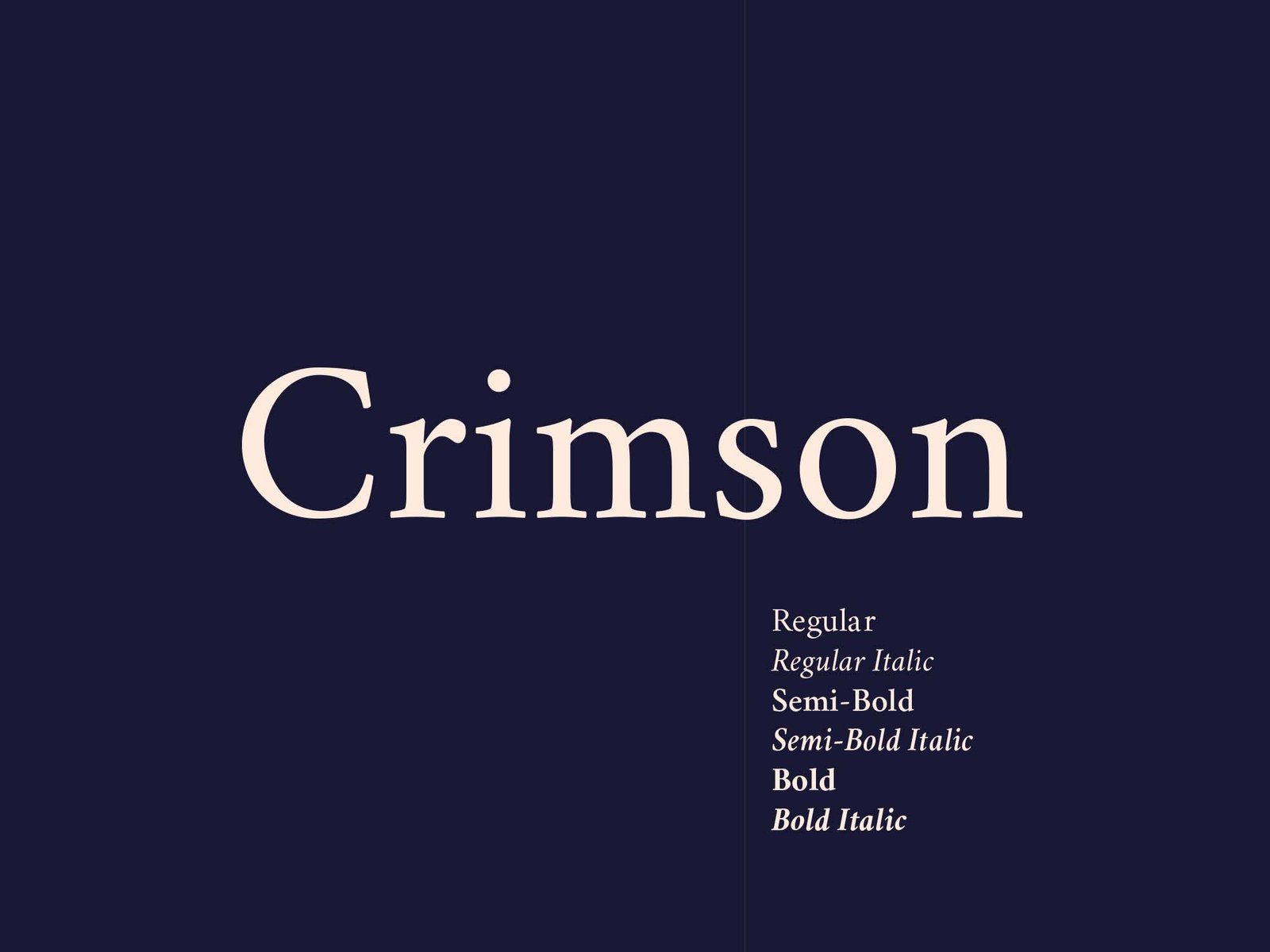
The font family is designed by Sebastian Kosch, and you can sense careful thought in the proportions. It follows the tradition of humanist book faces yet keeps a fresh presence. The design direction respects historical models without copying them blindly, which gives it a trustworthy, crafted character that works well in long passages of text.
The letterforms show a modest stroke contrast, open counters, and a relaxed rhythm. The spacing feels slightly generous, which helps with readability in paragraphs. In smaller sizes, the text holds together well, though very small captions may need testing. Its mood is scholarly but approachable. It shines in body copy, essays, and editorial work, but it is less suited for loud, bold display use where strong impact or modern sharpness is needed.
Where Can You Use Crimson Text Font?
In my own projects, Crimson Text Font works best in long-form reading: novels, essays, academic texts, and editorial layouts. As a serif font family, it handles dense paragraphs without tiring the eye. On print pages, it feels bookish and calm. On screens, with good line height, it still reads smoothly and comfortably.
At medium sizes, it suits article intros, pull quotes, and refined headings that need a literary tone. I often pair it with a clean sans-serif for navigation, captions, or UI elements. That mix gives a clear visual hierarchy: Crimson Text Font for narrative text, the sans-serif for structure and quick scanning, keeping typography clear and friendly.
For branding, I see it fitting publishers, cultural institutions, education platforms, or heritage brands that value history and trust. It is not ideal for flashy tech identities or loud youth brands, as the mood stays more thoughtful than energetic. In layouts, it performs better with comfortable margins and moderate column widths, where its careful rhythm and classic style can really breathe.
Font License
From my experience, Crimson Text Font is usually offered under a permissive licence, but terms can change over time. I always recommend checking the latest licence details on the official source before using it in commercial work. For both personal and client projects, confirming usage rights is a necessary step.
My honest takeaway as Ayan Farabi: Crimson Text Font is a dependable book face that rewards careful layout and thoughtful projects, rather than quick, flashy work.


Leave a Reply