
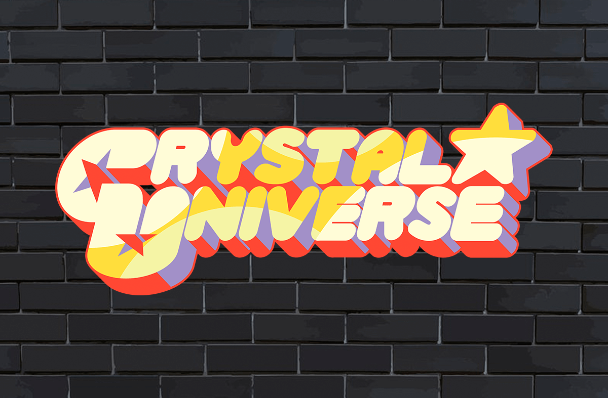

About Crystal Universe Font
I first picked up the Crystal Universe Font while testing options for a calm, modern poster series. I needed something clean, bright, and easy to read, but with a little personality. Many geometric fonts felt too cold, while softer ones looked childish in this context.
Crystal Universe Font sat somewhere in the middle, which made me curious. I tried it on titles, short quotes, and simple layout work for Free Fonts Lab mockups. The typeface felt steady and neat, so I decided to push it through a few real layouts to see how far it could go.
Font Style & Design Analysis
Crystal Universe Font is a sans-serif typeface with a clean and slightly futuristic voice. The letters look simple at first, but there is a quiet sharpness in the straight strokes and corners. It feels modern without shouting, and that gives it a steady, controlled tone on the page.
The designer is unknown, so I judged it only by how it behaves in real layouts. I checked it against other neutral sans fonts that I use often. In those tests, Crystal Universe Font held up fairly well, especially for digital work and quick branding drafts where a tidy, geometric feel is useful.
The letterforms are mostly uniform, with even stroke widths and a predictable rhythm from line to line. Spacing is on the tighter side, so I often add a bit of tracking for headings. The mood is clean and cool, which works for tech, science, and minimal brands. Its main limit appears in long body copy, where the tight spacing can feel a bit stiff.
Where Can You Use Crystal Universe Font?
In my tests, Crystal Universe Font worked best in medium to large sizes. Titles, section headers, and short taglines all looked clear and controlled. On posters, app screens, and simple landing pages, the sans-serif shapes made the visual identity feel modern, but not overly trendy or loud.
For small text, like footnotes or dense UI labels, the tight spacing can make things feel cramped. In those cases, I either increased the letter spacing slightly or paired it with a softer sans-serif companion for body text. It pairs well with a rounder font family, or with a light serif for contrast in more refined layouts.
I would use Crystal Universe Font for tech start-ups, casual sci‑fi themes, event graphics, or clean product promos. It suits younger audiences and digital-first brands that want clarity with a hint of futuristic character. When I keep the text short and give the letters room to breathe, the typography feels balanced and confident.
Font License
Before using Crystal Universe Font in any paid or commercial project, I always check the current licence from the original source. Some versions allow free personal use, while commercial rights may need a proper licence. It is worth reading the terms closely, especially for client branding or large print runs.
My honest takeaway as Ayan Farabi: Crystal Universe Font is a useful, neat sans-serif for focused, modern layouts, as long as you handle spacing with care.


Leave a Reply