
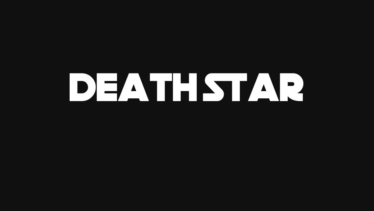

About Death Star Font
I first reached for the Death Star Font while working on a sci-fi themed poster for a small film event. The client wanted something bold, cinematic, and clearly inspired by classic space opera visuals, but not a direct copy. I needed a typeface that felt familiar to fans yet still usable in a real layout.
As I tested it, the font gave me a strong sense of nostalgia. The sharp angles and futuristic shapes sat nicely with dark backgrounds and glowing accents. I decided to explore it deeper for a review on Free Fonts Lab, because I knew many designers face similar needs when building science fiction visuals and fan-focused graphics.
Font Style & Design Analysis
The Death Star Font is a pure display typeface, built to grab attention rather than handle long reading. Its letterforms echo classic space movie titling, with heavy strokes, tight structures, and strong geometric control. This design direction pushes the eye towards the centre of each word, which works very well for logos, headlines, and short phrases.
The exact creator of the Death Star Font is designer unknown, which is quite common with fan-inspired fonts across the web. That lack of clear authorship sometimes makes licensing less straightforward, but from a visual point of view, the approach is clear: it aims to echo a famous cinematic universe while still holding its own as a bold display font.
The letterforms are wide, with firm verticals and angled cuts on many terminals. Spacing is naturally tight, so I often add a bit of tracking when setting longer words. The rhythm feels blocky and powerful, which sets a strong mood but also limits subtlety. As a display font family, it works best in short bursts. It struggles in body text, small captions, or complex paragraphs where readability becomes more important than style.
Where Can You Use Death Star Font?
I find the Death Star Font most useful in large titles, event posters, banner graphics, and themed social posts. It shines when you give it space, big sizes, and strong contrast. On screens, it holds shape well in headers and thumbnails. On print, it works nicely for cover designs or DVD-style packaging.
For smaller text, the thick forms and tight spacing start to fight readability. At small sizes, counters close up and individual letters lose clarity. Because of that, I always pair it with a clean sans-serif or simple serif for body copy. This contrast lets the dramatic display typography handle the mood while the supporting font maintains comfort for reading longer content.
In terms of audience, it speaks directly to fans of science fiction, gaming, and retro-futuristic design. I would use it for fan events, cosplay flyers, YouTube channel branding, or themed merchandise. When building a visual identity, I keep the Death Star Font for the logo or main wordmark, then build the rest of the system with more neutral fonts, so the visual identity stays flexible and not locked into a single strong reference.
Font License
Licensing for the Death Star Font can vary depending on the source where you download it. Some releases allow only personal use, while others may include limited commercial rights. I always recommend checking the official licence text and, if needed, contacting the owner before using it in any paid or client project. My own takeaway: treat it as a specialised tool, great for the right theme, but always double-check the legal side before you commit it to a major brand.


Leave a Reply