

About Default Font
I first picked up Default Font while working on a simple web dashboard for a small client. They wanted something clean, calm, and easy to read on many screens. I needed a typeface that did not draw too much attention, but still felt designed with care.
As I tested it across headings, labels, and body text, the font started to make sense. It behaved like a quiet helper. Nothing flashy, nothing dramatic, just steady work. That is what made me review it in detail for Free Fonts Lab, to see where it really fits in daily design work.
Font Style & Design Analysis
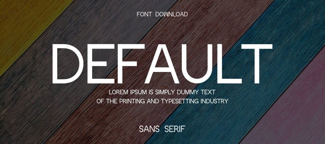
Default Font is a sans-serif typeface with a straightforward, neutral voice. The forms feel modern but not cold, so it sits well in many visual identities. Strokes are even, with very little contrast, which helps the font stay calm and stable on screen and in print.
The designer is unknown, and that actually shapes how I see the font family. Without a strong author brand behind it, I judge it only by how it behaves in real layouts. That makes me focus on spacing, rhythm, and clarity instead of story or hype around the name.
The letterforms are simple, with open counters and a friendly x-height that keeps text readable at smaller sizes. Spacing out of the box is slightly loose, which works nicely for UI labels and longer paragraphs. In tighter headlines, I sometimes nudge the tracking down a bit. The sans-serif structure gives it a practical mood, but it can feel a bit plain in highly expressive branding, so I avoid it when I need strong personality.
Where Can You Use Default Font?
I see Default Font working best in everyday digital products, like dashboards, apps, and simple websites. At medium and small sizes, the typography stays clear, and the shapes hold up well on different screens. For body text in interfaces, the font style behaves predictably, which speeds up layout decisions.
In print, it suits brochures, forms, and lightweight editorial pieces where function comes first. For large posters or strong brand headlines, I often pair this sans-serif with a more characterful display font. A bolder companion in the title and Default Font in the supporting text creates a nice balance between voice and clarity.
If you design for schools, non-profits, or practical services, this typeface can support a friendly but serious tone. It works for simple logos too, especially when the brand does not need a loud mark. In those cases, I refine kerning by hand, because the default spacing can feel a touch relaxed for tight wordmarks.
Font License
Before using Default Font in any client or commercial project, I always check the current licence details from the original source. Terms for personal and commercial use can change, so it is safer to confirm permission, usage limits, and any attribution needs each time.
My honest take as Ayan Farabi: this is not a showpiece font, but it is a steady, useful tool that quietly does its job when you need clean, readable type.


Leave a Reply