

About Defused Font
I came across Defused Font while searching for a bold, uneasy title style for a short film poster. The brief called for something loud but not cartoonish, and most options felt either too clean or too messy. This typeface caught my eye because it balanced chaos with control.
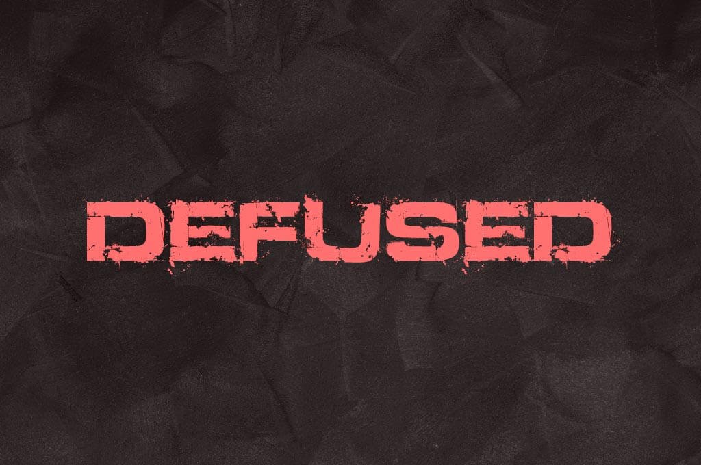
I tested it first on a dark, textured background and the letters instantly carried tension and drama. That reaction made me curious enough to explore it deeper for a feature on Free Fonts Lab. I wanted to see how far I could push it in real layouts, not just quick mock-ups.
Font Style & Design Analysis
Defused Font is a pure display typeface, built to grab attention rather than fade into the background. It feels rough, stressed, and slightly unstable, like letters caught in motion or shaken by an explosion. The shapes lean towards bold blocks, with broken edges that suggest wear and pressure.
The designer of this font is designer unknown, at least from the sources I could check with confidence. That lack of clear authorship fits its mood a bit; it feels like something found on a warning sign in an abandoned place. Still, I would have liked a note from the creator about the idea behind the font family.
The letterforms have heavy strokes, chipped corners, and uneven outlines that create a noisy but controlled texture. Spacing is quite tight, which helps when you want loud, compact headlines, but it can feel cramped in longer words. The rhythm leans aggressive and tense, so it works best for short phrases. As a display font, it struggles in body text or subtle branding, yet shines when you need impact and a sense of danger.
Where Can You Use Defused Font?
I found Defused Font most effective in large sizes, especially for posters, cover art, and social banners. On the film poster test, the type sat well over grungy textures and dramatic lighting. At those scales, every crack and dent in the lettering adds to the story. Small sizes, though, quickly lose detail and become muddy.
This font suits horror films, thriller titles, protest graphics, dystopian game logos, and any project that needs stress or urgency in its visual identity. I would pair it with a clean sans-serif for body copy, to keep reading comfortable while the display letters shout the message. Using too many distressed fonts together can make layouts feel noisy and unfocused.
On packaging or album art, it works well when used in short words or acronyms centred in the layout. Long phrases can feel heavy, so I limit it to 2–4 word headlines. When I designed a mock game cover, I let Defused Font handle the main title, then built calmer typography around it. That contrast made the chaos look intentional, not accidental.
Font License
The licence for Defused Font can vary depending on where you download it from, and terms may change over time. Always check the official source for current details before using it in client work, commercial projects, or large distributions. For personal experiments, I still confirm the licence so there are no surprises later.
My honest take as Ayan Farabi: I reach for this font when I need intensity and discomfort in a design. It is not a daily workhorse, but when the theme is fear, pressure, or collapse, it earns its place in the layout.


Leave a Reply