

About Determination Font
I came across Determination Font while searching for a bold title style for a game-themed poster. Its name caught my eye, but the shapes kept my attention. I wanted something loud, a bit playful, and very clear from a distance. This typeface seemed to promise that balance.
I tested it on a series of mock game covers and social posts for a client concept. The font family held up better than I expected in bright colours and dark backgrounds. That first round of layouts told me this was worth a deeper look for Free Fonts Lab readers.
Font Style & Design Analysis
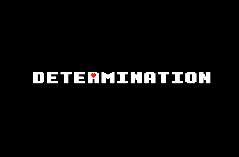
This is a pure display typeface, built to grab attention rather than sit quietly in body text. The font style feels bold, chunky, and slightly playful, with a strong retro game energy. Its blocky structure and tight shapes make each word feel like a logo or level title.
The exact creator of this font is designer unknown, at least from the sources I could trace. That does limit how much background story I can confirm about its design process. Still, the visual choices speak clearly enough about its intent and target use.
The letterforms use thick strokes with simple, almost pixel-like geometry. Counters stay open, so words remain readable even at busy sizes. Spacing is fairly tight by default, which helps titles feel compact and powerful. The rhythm is energetic rather than calm, so it sets a loud mood. It works best in short words or stacked headlines, not long paragraphs.
Where Can You Use Determination Font?
I see Determination Font fitting best in projects that need bold, game-like energy. Think indie game covers, streaming banners, event posters, or playful youth branding. At large sizes, the display shapes really shine, and each letter becomes a small graphic element on its own.
At medium sizes, such as subheadings or menu labels, it still reads well if you give it enough breathing room. I would not use it for long copy or small captions, though. The chunky forms can feel heavy and tiring when reduced too far. It wants to shout, not whisper.
For pairing, I usually match this display font with a clean sans-serif for body text, something neutral and modern. Keep colour palettes simple, maybe two or three tones, so the typography remains the main focus. In youth, gaming, or pop culture layouts, it can anchor the whole visual identity with confidence.
Font License
Before using Determination Font in client work or paid projects, always review the licence details from the original source. Some versions allow personal use only, while commercial rights may require a different agreement. I always double-check terms, then keep a record, to protect both my work and my clients.
My honest takeaway as Ayan Farabi: this display font is not for every project, but when you need loud, game-ready titles, it does the job with strong character and clear impact.


Leave a Reply