
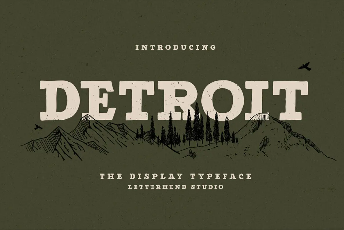

About Detroit Font
I ran into the Detroit Font while searching for a bold title face for a poster series. I needed something loud, a bit aggressive, but still readable from a distance. The shapes looked sharp and confident, so I saved it and came back later when a client brief finally matched its energy.
That project was a streetwear-inspired event flyer with a strong urban mood. I tested Detroit Font across different colour backgrounds and textures. It held its weight very well. The heavy strokes, tight forms, and punchy presence made it stand out in my mockups for Free Fonts Lab, so I decided to explore it more deeply.
Font Style & Design Analysis
Detroit Font is a pure display typeface with a very assertive voice. The letters feel compact and dense, with hard angles and a strong industrial tone. This is not a quiet font family. It wants attention, and it gets it very quickly on posters, banners, or large digital headers.
The designer is unknown, which is common with many bold display fonts that move around design communities. That said, the concept looks deliberate rather than random. The overall typography choices suggest someone who understands impact and hierarchy, even if they did not aim for broad, multi-purpose use.
The letterforms have thick strokes, narrow counters, and very little contrast. Spacing is tight, which adds pressure and speed to each word. At large sizes, this rhythm feels energetic and gritty. At smaller sizes, the spacing can close up and become harder to read, so I avoid it for long text. Strengths lie in big titles, logos, and short phrases where power matters more than comfort.
Where Can You Use Detroit Font?
I see Detroit Font working best in bold, urban, or alternative visual identity systems. Music posters, streetwear graphics, motorsport themes, and gaming covers all match its heavy voice. When I used it for an event flyer, it immediately pushed the layout towards a rough, city-style mood without extra graphics.
As a display font, it really needs large sizes to breathe. Headlines, hero text, badges, and logo marks are safe zones. At body text size, the tight spacing and dense shapes fight legibility. I often pair it with a simple sans-serif for body copy. That contrast keeps the page readable while letting Detroit carry the attitude.
For younger or edgy audiences, the font style suggests rebellion and motion. It suits brands that do not want to look clean or corporate. I would avoid it for formal institutions, long-form reading, or very soft lifestyle brands. Used in short bursts, though, this typeface can add real punch to layouts that need a strong focal point.
Font License
Before using Detroit Font in any client or commercial project, I always recommend checking the current licence from the official source. Terms can change, and free use for personal work does not always mean free commercial rights. When in doubt, read the licence text carefully or contact the owner.
My personal takeaway as Ayan Farabi: Detroit Font is not a font for every project, but when the mood is right and you need raw, heavy impact, it does the job with conviction.


Leave a Reply