
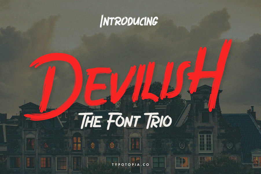

About Devilish Font
I came across Devilish Font while working on a dark fantasy book cover for a client. The project needed something moody, but not cartoonish or cheap. I wanted a typeface that felt serious, with sharp details, yet still readable in real layouts.
The name caught my eye first, but the design kept me interested. I tested it in mock titles, chapter headings, and some poster-style layouts for Free Fonts Lab. I wanted to see if this serif font could balance drama and clarity without taking over the whole design.
Font Style & Design Analysis
This is a serif typeface with a strong, dramatic voice. The overall font style leans towards gothic fantasy rather than classic book typography. You get pointed serifs, tense curves, and a slightly compressed feel. The mood is dark, but it still holds enough structure to stay usable in real projects.
The creator of Devilish Font is designer unknown, at least from what I could confirm. That does not change how it behaves in a layout, but it does mean I approach it more carefully. When I do not know the foundry history, I run more print tests and on-screen checks before trusting it in client work.
The letterforms have tall vertical strokes, tight join areas, and sharp triangular serifs. The spacing feels a bit tight at default, especially in uppercase words, so I often add a bit of tracking for headlines. The rhythm works best in short phrases, not long paragraphs. It delivers strong mood and character, but it is not a neutral workhorse serif.
Where Can You Use Devilish Font?
I find Devilish Font most effective in titles, logos, and headline work. It can shape the whole visual identity of fantasy books, game covers, horror posters, or metal band graphics. When used big, those sharp serifs and dark shapes come through clearly and add real presence.
At smaller sizes, the fine details start to blend together, especially on lower-quality screens or rough paper. For body text, I would pair it with a calmer serif or a clean sans-serif font family. Use Devilish Font for the dramatic parts only, such as headings, pull quotes, or short taglines.
It works well when you set it in all caps with wider spacing for posters and banners. For mixed case, I keep the line lengths short so the tension in the letterforms does not become tiring. Paired with a simple geometric sans or a light serif, it creates a clear hierarchy that lets the dark, expressive typography stay readable.
Font License
The licence terms for Devilish Font can change depending on the source, so I never assume anything. Always check the official licence for personal and commercial use before starting client work. When the details feel unclear, I treat it as personal testing only until I get solid confirmation.
My takeaway as Ayan Farabi: I use Devilish Font as a focused tool, not a general solution. When a project needs sharp, gothic energy in a serif package, it earns its place, as long as I keep it big, bold, and well-supported by a calmer companion typeface.


Leave a Reply