
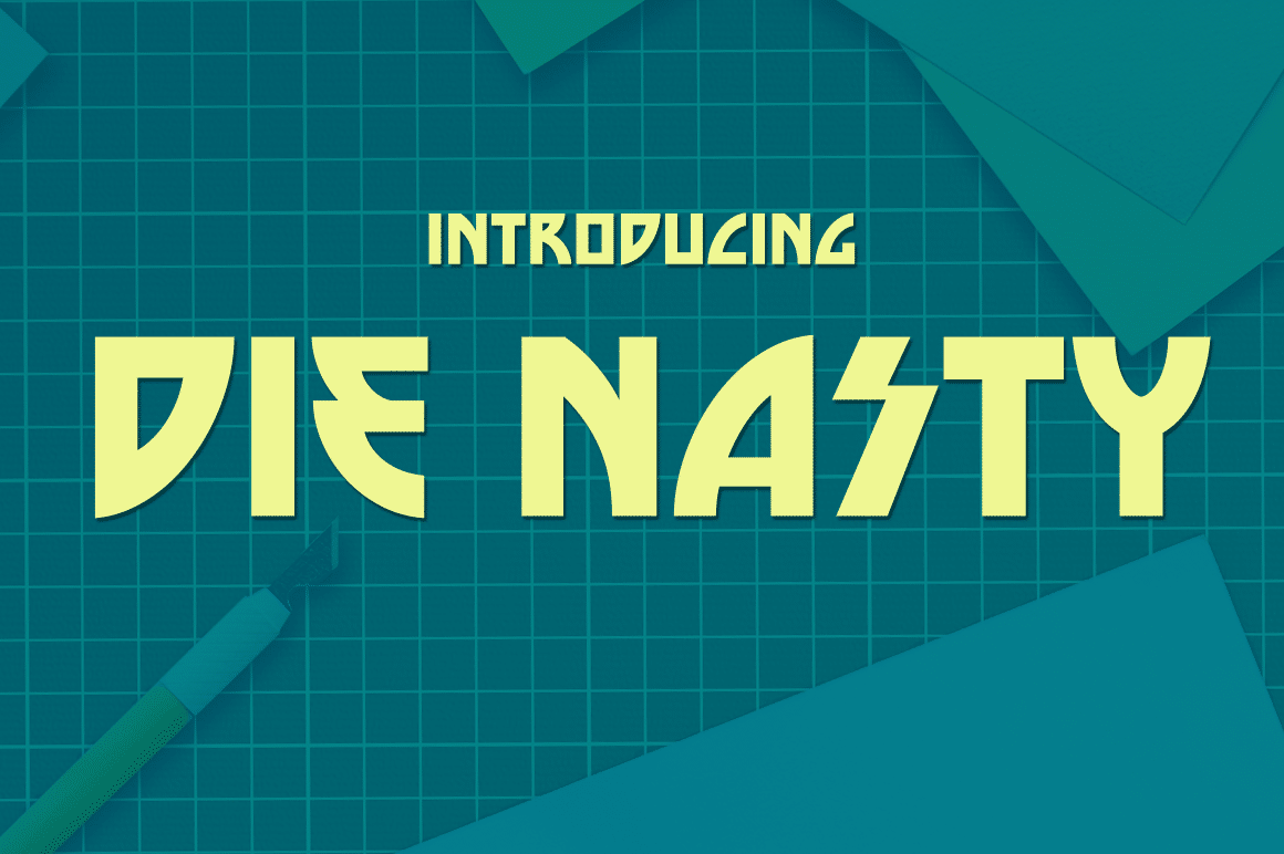

About Die Nasty Font
I bumped into the Die Nasty Font while hunting for a bold headline style for a retro poster job. The client wanted something loud, slightly rough, and a bit dramatic, without looking cheap or cheesy. This typeface stood out because it felt intense, but still controlled enough for real design work.
I decided to test it on a series of 80s-inspired title cards and some mock film posters for Free Fonts Lab. I wanted to see how it handled strong colour, tight layouts, and busy backgrounds. It gave me a tough, gritty voice that worked well when I needed attention fast.
Font Style & Design Analysis
The Die Nasty Font is a pure display typeface, built for impact rather than reading comfort. Its structure feels sharp and condensed, with heavy strokes that pull your eye straight to the headline. The font style has a strong retro action-movie mood, like old VHS covers or grindhouse posters.
The designer is unknown, which is a shame, because there is a clear sense of purpose in this font family. It does not look random or rushed. The curves, angles, and joins feel deliberate, like someone studied pulp film typography and then pushed it a bit further into drama and tension.
The letterforms are chunky, with tight spacing that helps create a solid block of type. In big sizes, the rhythm feels aggressive and confident, almost like a logo stamped on metal. In smaller sizes, though, the density becomes a weakness, as counters close up and details blur. As a display font, it shines in short words, names, and titles, but long text lines quickly feel heavy and tiring.
Where Can You Use Die Nasty Font?
I find the Die Nasty Font most useful in title-driven layouts where the message can be short and loud. Think movie posters, gaming covers, event flyers, or music artwork with a rough edge. It works best when you let it dominate the visual identity and support it with calmer secondary typography.
At large sizes, the texture and weight give amazing energy, especially over dark images or gradient backgrounds. On screens, it holds up nicely in hero banners and YouTube thumbnails. In small sizes, though, the heavy letterforms and tight spacing make it hard to read, so I avoid using it for buttons, captions, or body copy.
I usually pair this typeface with a clean sans-serif or a neutral serif that can handle long text without fighting the main heading. Simple layouts, generous margins, and clear hierarchy help keep the design from feeling overcrowded. When treated with restraint, the font can bring real drama without turning the whole design into noise.
Font License
Before you use the Die Nasty Font in any client or commercial project, check the official licence details from the original source. Terms for personal and commercial use can change, and I never assume a font is free for all uses. Taking a moment to confirm the licence saves trouble later.
For me, this typeface is a sharp tool: powerful in the right context, too much in the wrong one. When I need a gritty, cinematic title with strong presence, it stays on my shortlist.


Leave a Reply