
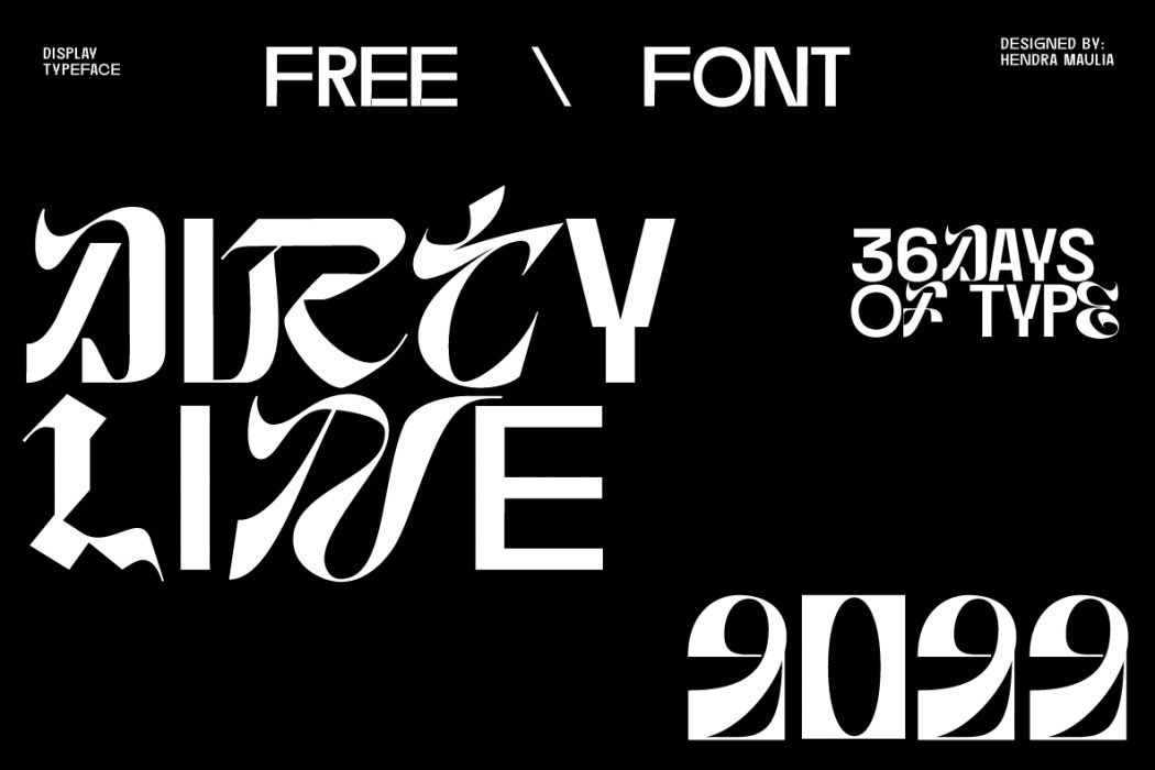

About Dirtyline 36Daysoftype Font
I came across Dirtyline 36Daysoftype Font while searching for a bold headline option for a poster series. I needed something loud, expressive, and slightly experimental, but still readable. The strong shapes and unusual forms caught my eye, so I decided to test it in a few concept layouts for Free Fonts Lab.
What drew me in first was its playful energy. The Dirtyline 36 Days Font feels like it wants to take centre stage, not sit quietly in the background. I wanted to see if that strong personality could work for real client-style visuals, not just quick mockups or trend-driven designs.
Font Style & Design Analysis
This is a pure display typeface, and it shows that clearly from the first word you set. The shapes are bold and graphic, with a strong poster-like presence. It feels built for attention, not for long reading. The font style leans towards playful experimentation, with a mix of sharp edges and rounded details that gives each character a distinct voice.
The designer is not clearly credited in the material I could access, so I will treat it as designer unknown. Even so, the intent behind the font family feels clear. It looks like part of a creative challenge or lettering exploration, shaped for striking visuals rather than strict typographic systems. That gives it a very handmade but controlled feel.
Looking closely at the letterforms, you will see tight spacing, compact widths, and strong vertical rhythm. The capital letters feel especially powerful, almost like blocky shapes carved from a single piece. There is a clear sense of fun, but that comes with limits. Small sizes reduce legibility fast, and long words can feel heavy. Used in short lines, big sizes, and open layouts, the display nature becomes a real strength.
Where Can You Use Dirtyline 36Daysoftype Font?
In my tests, this font worked best as a large headline or a hero word. Posters, event titles, album covers, and social media graphics all suited the Dirtyline 36 Days Font well. When you let the characters breathe with good spacing and margins, the energy of the typeface becomes a visual hook.
I would not use it for body copy or long subheadings, as the bold forms tire the eye. On screens, it performs strongly above 36px, especially on clean backgrounds. In print, it shines on large formats like A3 or bigger. It can work for youth-focused brands, streetwear visuals, or art and music promotions that welcome expressive typography.
For pairing, I had the best results when I matched it with a simple sans-serif for body text and small labels. Keeping other elements calm allows this display font to do the loud work. If you use colour, solid high-contrast palettes help keep the letterforms clear. The Dirtyline 36 Days Font is not a quiet partner, so treat it as the star, not part of a busy crowd.
Font License
I could not confirm a single fixed licence for Dirtyline 36Daysoftype Font, so I would be careful with usage. Always check the original source or creator for the current licence terms. Make sure personal, client, and commercial projects are all clearly allowed before you move beyond tests or mockups. For me, that check is a non-negotiable step.
My honest takeaway as Ayan Farabi: this font works best when you accept its strong personality and give it room. It is not a tool for every project, but when the brief calls for bold, playful display typography, it can deliver striking and memorable results.


Leave a Reply