

About Domaine Font
I first reached for Domaine Font while working on a wine label concept that needed a quiet sense of tradition. The brief asked for something classic, but not stiff or dusty. I wanted a serif that felt bookish yet still sharp enough for modern packaging work and editorial layouts.
As I tested options for that project, Domaine kept standing out on my screen. Its curves felt calm, and the contrast in the strokes sat in a very sweet spot. It looked serious, but not cold. I decided to explore it more deeply, make notes for future branding work, and later share my thoughts on Free Fonts Lab for other designers facing similar choices.
Font Style & Design Analysis
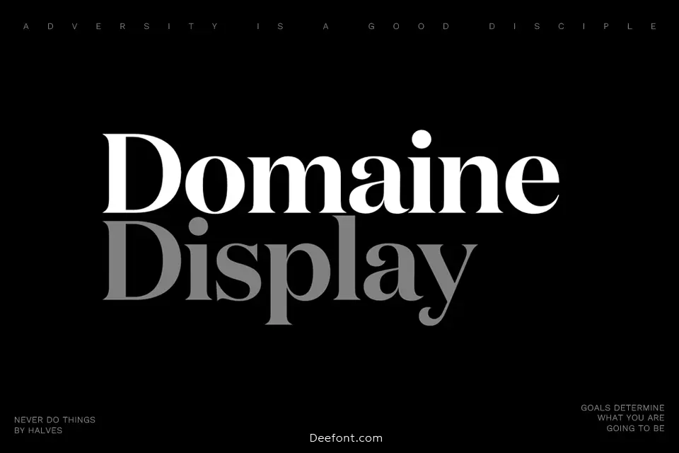
Domaine Font is a serif typeface with a strong literary presence and a slightly dramatic profile. The high contrast between thick and thin strokes gives it a refined, almost book-jacket look. The overall silhouette feels compact and confident, so text blocks appear dense, but still readable when handled with care.
The font comes from the respected type foundry Klim Type Foundry, designed by Kris Sowersby. Knowing his work, I expected careful spacing and thoughtful details, and Domaine follows that pattern. It feels like it was drawn with long reading, editorial work, and identity systems very much in mind, not just quick headlines.
The letterforms have elegant, slightly pointy serifs and a clear vertical stress, which adds a formal mood. Lowercase shapes feel tight and controlled, while capitals look strong and stately. Spacing is on the snug side, so large sizes look crisp, but small body text can feel heavy if lines are too long. Its strengths lie in titles, pull quotes, menus, and refined branding; it is less suited to tiny captions or dense user interface text.
Where Can You Use Domaine Font?
In my own tests, Domaine works beautifully in editorial layouts, such as magazine feature titles and long-form articles with generous margins. At display sizes, the serif details and contrast really show their character without breaking the grid. It gives pages a literary, collected tone that suits cultural, food, or design content.
For branding, I find Domaine Font fits well with boutique products, thoughtful lifestyle brands, and heritage-inspired visual identities. It brings a sense of care and history without looking like a museum piece. I often pair it with a clean sans-serif for body copy, letting Domaine handle logos, wordmarks, and key headings while the sans keeps small text clear.
On screens, Domaine performs best when used a bit larger than you might expect for a serif font family. Headlines, hero sections, and navigation labels feel confident and readable. For print, it holds up nicely in book covers, labels, menus, and posters. I would avoid tiny footnotes or dense tables, as the contrast and tight rhythm can make fine details feel cramped.
Font License
The licensing for Domaine Font can vary depending on the vendor, format, and intended use. I always treat it as a commercial typeface and never assume free usage rights. Before using it in client work or large projects, you should carefully review the licence terms from the official source and secure the appropriate licence.
My honest takeaway as Ayan Farabi: when a project needs a serious, literary serif with personality and control, Domaine stays on my shortlist, as long as I respect its limits at very small sizes.


Leave a Reply