
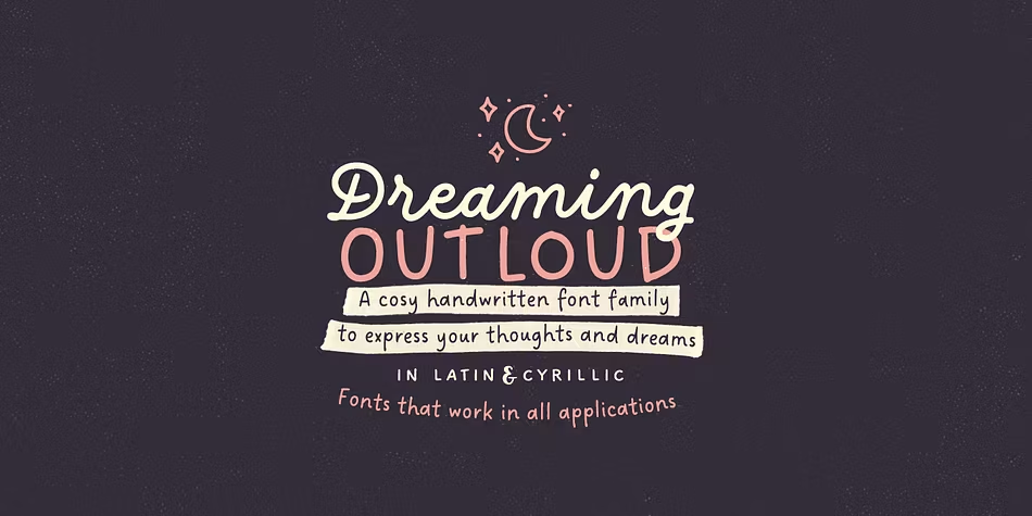

About Dreaming Outloud Font
I came across the Dreaming Outloud Font while searching for a soft, friendly script for a packaging mockup. I needed something casual, but still readable. The font caught my eye because it felt relaxed, like quick handwriting on a notebook, yet it did not look messy or rushed.
I decided to test it on a small range of skincare labels for a concept project I was building for Free Fonts Lab. I wanted a script that felt personal, but not overly romantic or decorative. This typeface seemed to sit right in that middle space, so it felt worth a closer look in real layouts.
Font Style & Design Analysis
This is a script font with an easy, handwritten look. The strokes feel like they were drawn with a smooth pen rather than a brush. Letters lean slightly, which gives the line a natural flow. It feels informal, friendly, and quite modern, without the heavy curls you see in many decorative scripts.
The designer is unknown, at least from what I could confirm through normal research. That lack of clear authorship does make me careful about licensing and usage. Still, from a design point of view, the font family looks coherent, and the weight and curves suggest a single hand behind it, rather than a quick auto-trace or rough conversion.
The letterforms have rounded corners, soft joins, and a relaxed baseline, so the rhythm feels loose but still organised. Spacing is on the tighter side, especially in lowercase pairs like “ra” and “ll”, which can close up at small sizes. It shines in short words and headings. Longer text blocks feel a bit busy, so I treat it as a display script for key phrases, not body copy.
Where Can You Use Dreaming Outloud Font?
I found the Dreaming Outloud Font most useful in branding that needs warmth without drama. It works nicely for product packaging, handmade goods, lifestyle blogs, and informal logos. Used large, the curves show clearly and the script character feels inviting. It fits brands that want to sound personal, kind, and easy-going.
On social media graphics, this script font works well for quotes, short captions, and title slides. At medium and large sizes, the strokes stay clean and readable. At very small sizes, details can blur, especially on low-resolution screens. I avoid using it for long paragraphs or small body text, because the script flow becomes tiring to read.
In layouts, I like pairing this script style with a simple sans-serif for body text, to keep contrast clear. A light or regular sans-serif underneath a script headline gives balance. I also keep colour palettes soft or muted, so the handwritten character stays calm rather than loud. It responds well to generous line spacing and breathing room in the design.
Font License
The licensing for the Dreaming Outloud Font can vary depending on the source, and terms may change over time. I always treat it as unknown until I read the official licence carefully. Before you use it in any commercial project, check the original provider’s licence notes and make sure the allowed usage fits your needs.
For me, this font works best as a friendly accent script when I need something casual but still controlled. It is not perfect for every project, yet in the right place, it adds a quiet, human touch without stealing all the attention.


Leave a Reply