

About Druk Font
I first reached for Druk Font during a bold poster project that needed heavy, confident type. I wanted something loud but not messy, strong but still readable. While searching for the right voice, this font kept showing up with its huge presence and tight shapes.
What pulled me in was its weight and attitude. The blocks of type felt almost physical on the page. I tested it across a few layouts for Free Fonts Lab, trying different scales and colours. That testing phase showed me how this typeface behaves when pushed hard in real layouts, not just in pretty mockups.
Font Style & Design Analysis
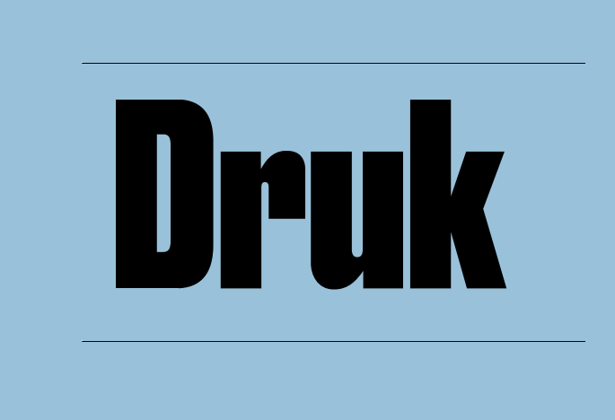
Druk Font is a sans-serif typeface with a very strong, compressed look. The strokes are thick, the counters are tight, and the overall shape feels compact and powerful. It looks like it was built for headlines that need to shout in a limited space, whether on posters, covers, or bold digital banners.
The designer is widely credited as Commercial Type, with the work of Bertil Nilsson and the team behind it. The type family offers many widths and weights, from narrow to wider styles. In my tests, the condensed and super heavy cuts stood out most, because they create dense blocks of text that act almost like graphic shapes.
The letterforms have short, flat terminals and tight spacing, which adds to the tension and energy on the line. Vertical strokes are dominant, so words stack into strong columns, especially in the narrower styles. This gives a clear rhythm, but it also means the font can feel crowded at smaller sizes. As a sans-serif, it stays clean and modern, yet its extreme proportions make it better for short text, big headlines, and clear hierarchy rather than long reading passages.
Where Can You Use Druk Font?
In my own work, Druk Font shines on posters, album covers, and bold social graphics. At large sizes, its compressed sans-serif structure makes every word feel urgent and deliberate. It works well when you have only a few words and you want each one to carry weight, especially in layouts with strong photography or colour blocks.
On screens, I like using it for hero headlines on landing pages or campaign sections, then pairing it with a softer sans-serif or a neutral serif for body copy. At smaller sizes, its tight spacing and heavy strokes can reduce legibility, so I avoid it for paragraphs or UI text. It behaves best when you give it space around the text block, letting the heavy letters breathe.
For branding, it suits sports teams, streetwear labels, music events, galleries, and any identity that leans into confidence and edge. I often pair Druk Font with a light, open sans-serif for contrast, or with a simple geometric typeface in regular weight. This balance keeps the brand system flexible: loud when needed, calm in support areas.
Font License
The licence for Druk Font can change depending on the source and intended use. Before you use it in client work, products, or large campaigns, always review the official licence details carefully. Check both personal and commercial terms, and make sure your usage, platforms, and distribution match what the licence allows.
My takeaway as Ayan Farabi: I reach for this font when I need disciplined noise – loud typography, but with control and purpose.


Leave a Reply