

About Drunken Hour Font
I first reached for the Drunken Hour Font while building a poster set for a small bar event. The client wanted something loud, playful, and just a bit messy, but still readable from across the room. I was hunting for a display look that felt human, not polished.
As I tested it in layouts for Free Fonts Lab, the font gave me a nice balance of chaos and control. The shapes looked irregular, but the words still held together. That contrast made me curious, so I pushed it through a full poster, social graphics, and a few mock labels to see how far it could go.
Font Style & Design Analysis
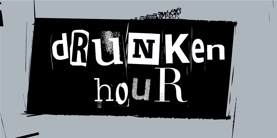
Drunken Hour Font is a bold display typeface built for big, loud moments. The letters lean and wobble slightly, like they were drawn after a long night out. Strokes feel chunky and uneven on purpose, which gives the font style a rough, handmade attitude that jumps out in busy layouts.
The designer is unknown, but the intention is quite clear in use. This is not a careful branding workhorse. It feels like someone sketched heavy marker letters, then digitised them without cleaning away the character. That raw energy gives the font family a casual, bar-sign mood that fits informal visuals.
The letterforms have wide bodies, tight counters, and a loose rhythm from character to character. Spacing tends to run a bit tight, so I usually add a touch of tracking for longer words. In short headlines, the uneven texture works well, but in small sizes the shapes can blur. As a display option, it shines in short, punchy phrases, not dense text blocks.
Where Can You Use Drunken Hour Font?
I see Drunken Hour Font working best in posters, event flyers, and social graphics for nightlife or casual food spots. Large sizes let the rough details breathe and make the playful typography feel intentional, not clumsy. It suits audiences who enjoy humour, street culture, or an unpolished, human touch.
On packaging, it can work for craft beers, snacks, or limited-edition labels where the brand voice is cheeky and bold. I would avoid using it for long taglines or ingredient lists though. In small sizes, the irregular shapes lose clarity quickly, and readability drops, especially on textured backgrounds or low-contrast colours.
For pairing, I usually match it with a clean sans-serif body font to balance the chaos. Let Drunken Hour Font handle the main headline, then keep subheads and body copy simple and neutral. In tight layouts, give the letters room with generous line spacing and margins, so the wild rhythm does not fight with other design elements.
Font License
Before you use Drunken Hour Font in paid client work or products, check the official licence details from the original source. Permissions for personal use and commercial use can differ, and terms sometimes change over time. I always review the licence carefully so my projects stay safe and compliant.
After testing it in real layouts, I see this font as a fun, situation-specific tool. When I need loud, imperfect energy for a headline, it earns a place in my kit, as long as I keep it big and use it with restraint.


Leave a Reply