

About Dunkin Doughnuts Font
I first reached for the Dunkin Doughnuts Font while working on a playful dessert brand that needed bold, simple lettering. The client wanted something friendly and easy to read, but not too serious. This typeface caught my eye because it felt casual, bright, and very direct.
I decided to test it more deeply for a review on Free Fonts Lab. I wanted to see how it behaved in real layouts, not just in mock logos. The chunky shapes promised strong impact, so I tried it in headings, short labels, and packaging concepts. That process revealed both its strengths and some clear limits.
Font Style & Design Analysis
This is a sans-serif font family with simple, heavy shapes and rounded edges. The design leans towards a soft, geometric look, almost like bubble letters cleaned up for branding work. It has a cheerful, approachable voice that feels perfect for food, kids, and casual products.
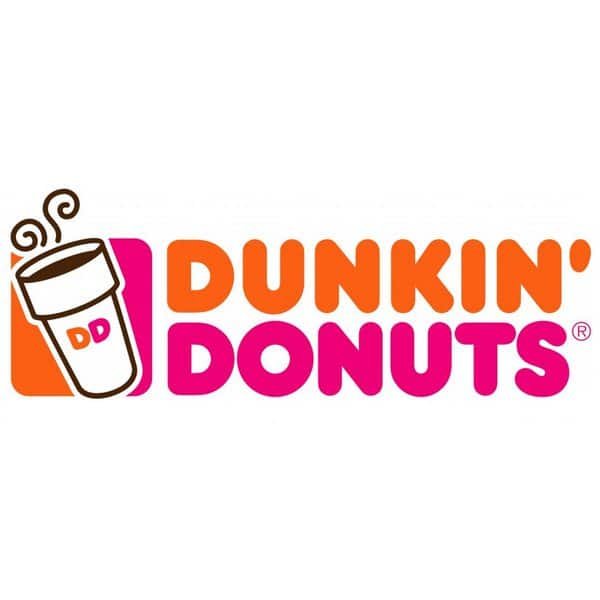
The original logo style comes from the well-known coffee and doughnut chain, but the exact digital font version many people use online has designer unknown status. Because of this, I treat it as an inspired sans-serif, not as an official corporate typeface. That difference matters when thinking about both quality and licensing.
The letterforms are wide, with thick strokes and generous counters, which helps legibility at medium sizes. Spacing is tight by default, giving text a compact, blocky rhythm. It creates strong visual identity in short words, but long sentences can feel heavy and crowded. As a sans-serif, it stays clean and modern, yet its weight makes it less flexible for body text or complex interfaces.
Where Can You Use Dunkin Doughnuts Font?
I find the Dunkin Doughnuts Font works best in bold display roles, not everyday reading. It shines in logos, shop signs, banners, and packaging where you only need a few strong words. At large sizes, its friendly curves and thick strokes really stand out and feel inviting.
In small sizes, the heavy strokes start to close up, and letters can look cramped, especially on low-resolution screens. For long paragraphs, I always switch to a lighter, more neutral sans-serif partner. Using this font only for headlines, price tags, or callouts keeps its energy focused and avoids visual fatigue.
For pairing, I like to combine it with a clean, understated sans-serif or a simple serif for body copy. In menus, posters, or social graphics, I let this typeface handle the hero words, then support it with calm typography underneath. It suits younger audiences, fun food brands, pop culture projects, and any layout that needs loud, uncomplicated charm.
Font License
The Dunkin Doughnuts Font often appears online in many versions, and licence terms can differ a lot. I never assume it is free for commercial work. For both personal and professional projects, I always check the original source and read the licence carefully before using it in any final client deliverable.
For me, this font is a useful, high-impact option when I need loud, friendly headlines, as long as I use it with care and in the right context.


Leave a Reply