
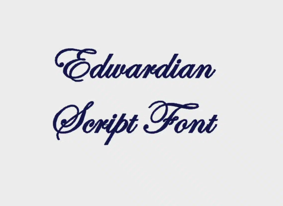

About Edwardian Script Font
I tested Edwardian Script Font while working on a wedding invitation set for a client who wanted something formal but still soft. I needed a script that felt classic, not trendy, and that printed cleanly on textured paper. That search soon turned into a deeper look at this Edwardian Font.
What pulled me in first was the flow of the strokes and how even basic words looked elegant without feeling overdone. On Free Fonts Lab, I often see scripts that try too hard, but this one felt more controlled. I decided to use it in a full layout, not just a logo, to see how it behaved in longer text lines and different sizes.
Font Style & Design Analysis
Edwardian Script Font is a script font, and it leans fully into that formal, handwritten feel. The letterforms are tall and sweeping, with high contrast between thick and thin strokes. It has a strong calligraphic base, almost like careful pen work on fine stationery. The overall font style is refined and very decorous.
The exact designer is unknown, but the design clearly follows the tradition of classic English roundhand scripts. You can see this in the long entrance strokes and the carefully shaped loops. It feels like someone studied old formal writing samples quite closely, then translated that rhythm into a digital typeface.
The lowercase letters connect smoothly, and most words look balanced without extra tracking. Capitals are large, ornate, and can easily dominate a line if overused. Spacing is tight, which suits a script font but can make dense paragraphs hard to read. The rhythm is elegant but slow, so it works better for short phrases than long blocks of copy, where it can start to feel heavy.
Where Can You Use Edwardian Script Font?
In my projects, Edwardian Script Font has performed best in titles and short lines where you want immediate elegance. It shines on wedding invitations, event cards, place settings, and certificates. At larger sizes, the graceful curves stay clear, and the high contrast looks sharp in both print and digital layouts.
At small sizes, the thin strokes can disappear, especially on low-quality printers or screens. For body text or long paragraphs, I pair the Edwardian Font with a simple serif or sans-serif font family for balance. Using it just for names, headings, or key phrases keeps the typography readable while still giving a strong decorative note.
This script font also works well for luxury branding, perfume packaging, or boutique logos that need a formal mood. It speaks best to audiences who expect tradition and ceremony rather than casual energy. When I set it with generous line spacing and plenty of white space, it feels calm and high-end, not crowded or flashy.
Font License
Before using Edwardian Script Font in any paid or public project, I always check the current licence from the original source. Some versions allow only personal use, while others may permit commercial work with certain limits. It is safest to read the terms carefully and confirm that your planned use fits the allowed conditions.
My honest takeaway as Ayan Farabi: I reach for this font when I need formality with clear structure, but I use it sparingly and let it be the accent, not the whole voice.


Leave a Reply