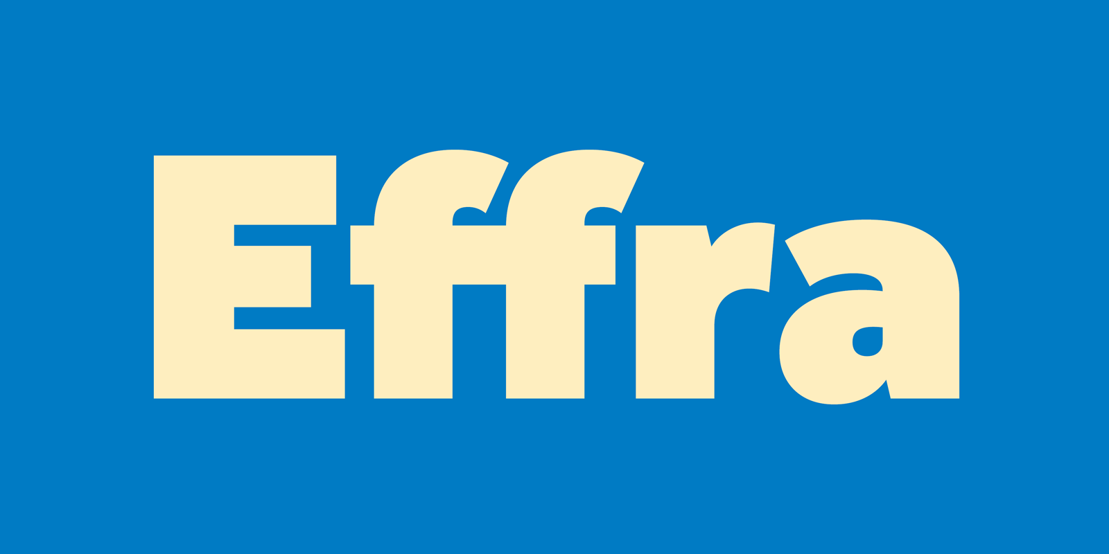
About Effra Font
I first reached for Effra Font while reworking a clean brand system for a tech client. The brief asked for something modern, friendly, and clear, without feeling cold or generic. I wanted a typeface that could sit quietly in a layout, yet still hold its own in headings.
During my early tests, I noticed how flexible the font felt in simple grids and tight UI layouts. The structure looked balanced, and the tone stayed calm even at larger sizes. That mix of clarity and softness made me want to explore it more deeply and share my thoughts here on Free Fonts Lab.
Font Style & Design Analysis
Effra Font is a sans-serif typeface with a clean, contemporary voice. The shapes feel simple at first glance, but there are small details that keep it from becoming bland. Strokes stay even, counters are open, and the whole font family leans toward a neutral, modern look that suits many layouts.
The design is based on rational, geometric ideas, yet it avoids looking too stiff. The curves feel slightly softened, and the terminals land in a controlled way. This gives the typeface a professional tone that still feels approachable. It sits somewhere between strict corporate geometry and a more human, everyday style of typography.
Looking closely at the letterforms, I like the clear shapes of the lowercase “a”, “e”, and “s”. Spacing is steady, which helps when setting long text blocks. The rhythm stays calm, so your eye moves across the line without effort. As a sans-serif font style, it works well for body copy and UI labels, but it will not suit projects that need high drama or strong personality. Think quiet confidence, not loud expression.
Where Can You Use Effra Font?
I find Effra Font very useful in brand systems that need a clean and reliable base. It works well for tech, education, and modern corporate identities, where clear typography matters more than visual flair. In headings, it gives a stable, organised feel without drawing too much attention to itself.
At smaller sizes, the open counters and tidy spacing really help. Interface labels, captions, footnotes, and form fields stay readable on screen and in print. When I pair it with a more expressive display typeface or a warm serif, it plays the supporting role nicely and keeps the layout grounded.
For large sizes, like posters or hero banners, the font still holds up, but it feels more understated than bold. I usually combine it with generous letterspacing and clear hierarchy to give it some air. It suits audiences who value clarity and structure: product dashboards, editorial systems, pitch decks, and simple packaging all benefit from this calm, orderly font family.
Font License
Before you use Effra Font in any client or commercial project, always review the licence terms from the official source. Some licences allow personal or testing use only, while others cover wider commercial work. I always double-check the current licence details, as terms can change over time and across platforms. For my own work, I see Effra as a solid choice when I need modern clarity without noise.


Leave a Reply