
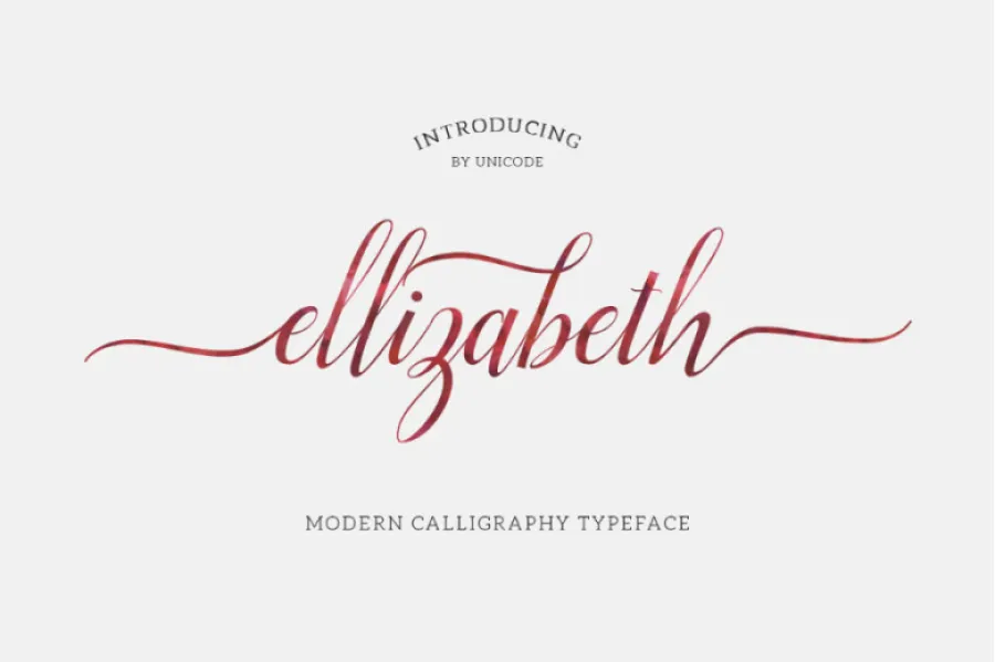

About Elizabeth Font
I came across Elizabeth Font while searching for a soft, romantic script for a small wedding stationery project. The brief needed something calm, legible, and slightly nostalgic, without looking overly decorative or childish. The name caught my eye first, but the letterforms kept me interested long enough to test it in real layouts.
I tried it in invitation headers, menu titles, and a simple monogram lockup. On screen, the curves felt gentle and controlled, not messy or rushed. That balance made me curious enough to explore it deeper for Free Fonts Lab, and to see how it behaved in print and different colour palettes.
Font Style & Design Analysis
Elizabeth Font is a script typeface with a clear, flowing stroke and a steady, confident rhythm. The letters link in a smooth line, but the shapes stay open and readable. It does not push into wild calligraphy or brush-style drama. Instead, it keeps a more classic script personality, which feels suited to formal or romantic themes.
The designer is unknown, and that sometimes happens with script fonts that move around various freeware collections. Because the origin is unclear, I look more closely at consistency and technical details. In this case, the character set feels modest but fairly coherent. You get the core Latin letters, basic punctuation, and enough glyphs to build short headlines and names.
The letterforms have soft contrast, with slightly thicker downstrokes and lighter connections between characters. Spacing is on the tight side, especially where loops and tails overlap. In larger sizes, the rhythm feels graceful and elegant. At smaller sizes, some joins start to merge and lose clarity. The font family works best when you give it space, short words, and clean backgrounds.
Where Can You Use Elizabeth Font?
In my tests, Elizabeth Font performed best in wedding invitations, save-the-date cards, and simple event logos. The script style adds warmth and a personal touch, especially for names, short headlines, or signature-style taglines. I would not use it for long paragraphs, but as a display accent it does its job well.
At large sizes, the curves show nicely and the flow between letters feels natural. On posters, greeting cards, or social media graphics, it can create a gentle focal point. At very small sizes, such as body text or busy captions, the strokes start to blur together. For that reason, I usually pair it with a clean sans-serif or serif typeface for supporting copy.
Branding-wise, this script font suits beauty products, wedding vendors, florists, handmade goods, and personal blogs. It speaks softly rather than loudly, which can help a brand feel approachable but still refined. I avoid using it in very corporate or tech contexts, where its romantic tone may send the wrong signal to the audience.
Font License
The licence for Elizabeth Font can vary depending on where you download it. Some sites list it as free for personal use only, while others may bundle different terms. I strongly recommend checking the current licence on the original source before using it in any commercial project or paid client work.
For me as a designer, Elizabeth Font is a pleasant, focused script that works well when used with care, clear hierarchy, and plenty of breathing room.


Leave a Reply