
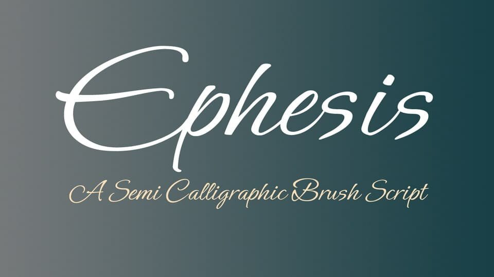

About Ephesis Font
I first tried the Ephesis Font while working on a small packaging concept for a handmade candle brand. I needed something that felt casual and personal, but not childish or messy. Many handwritten fonts looked too rough, but this one seemed softer and more relaxed.
The flowing strokes and gentle curves caught my eye during testing for Free Fonts Lab. I liked how the letters felt quick, like a confident note written in a hurry, yet still easy to read. That balance between style and clarity made me curious enough to explore it in a few real layouts.
Font Style & Design Analysis
The Ephesis Font is a handwritten typeface with a loose, informal energy. It looks like a fast pen script written with a light touch. The letters lean slightly, and the strokes feel natural, as if drawn in one go. It gives designs a simple, personal voice without feeling too ornate or romantic.
The official source lists this as a casual script, but the exact designer unknown note appears often in font directories. From my perspective as a user, the design feels like it came from everyday handwriting, then cleaned up for screen and print. It is not a showy calligraphy font, more like a tidy version of a quick signature.
The letterforms have open counters, long entry strokes, and soft terminals. Spacing is fairly loose, which helps legibility at medium sizes, though the rhythm can look airy in long lines of text. The mood stays relaxed and informal. It works well for short phrases, names, and headings, but it struggles in dense body copy or where strict alignment and precision are key.
Where Can You Use Ephesis Font?
In my tests, the Ephesis Font worked best for branding that needed a friendly, human touch. Think small shops, handmade goods, lifestyle blogs, or casual event graphics. At larger sizes on posters, headers, or packaging, the handwritten nature becomes clear and charming. The strokes feel inviting, not stiff or corporate.
At smaller sizes, especially on mobile screens, some of the loops and connections can start to blur. For that reason, I avoid using this handwritten font for long paragraphs or detailed UI text. Instead, I pair it with a clean sans-serif or simple serif for body copy, letting Ephesis handle headlines, short quotes, and callouts.
This handwritten font suits audiences who enjoy a natural, personal tone: craft brands, wellness projects, casual invitations, and social media graphics. It also works nicely on top of photos, as long as the background is not too busy. When set with generous line spacing and clear contrast, the font style adds warmth without shouting for attention.
Font License
The Ephesis Font is often listed as free, but terms can change across platforms. I never assume it is safe for commercial work without checking. If you plan to use it for client projects, products, or logos, always read the current licence details from the official source and keep a copy for your records.
For me, Ephesis works best as a light, personal accent rather than a main workhorse font. When I keep it for short, expressive text and support it with a solid primary typeface, it adds just enough character without getting in the way of clear communication.


Leave a Reply