

About Exmouth Font
I first reached for the Exmouth Font while working on a wedding invite set that needed soft drama without feeling cheap or overdone. The brief called for something flowing, readable, and a bit romantic, but not the usual overused scripts we see everywhere.
As I tested options for that project, this typeface stood out because its strokes felt relaxed, not stiff. The curves looked natural, almost like a calm pen hand on smooth paper. I decided to put it through a full layout test for headings, names, and short phrases, then later wrote this review for Free Fonts Lab to share how it behaved in real work.
Font Style & Design Analysis
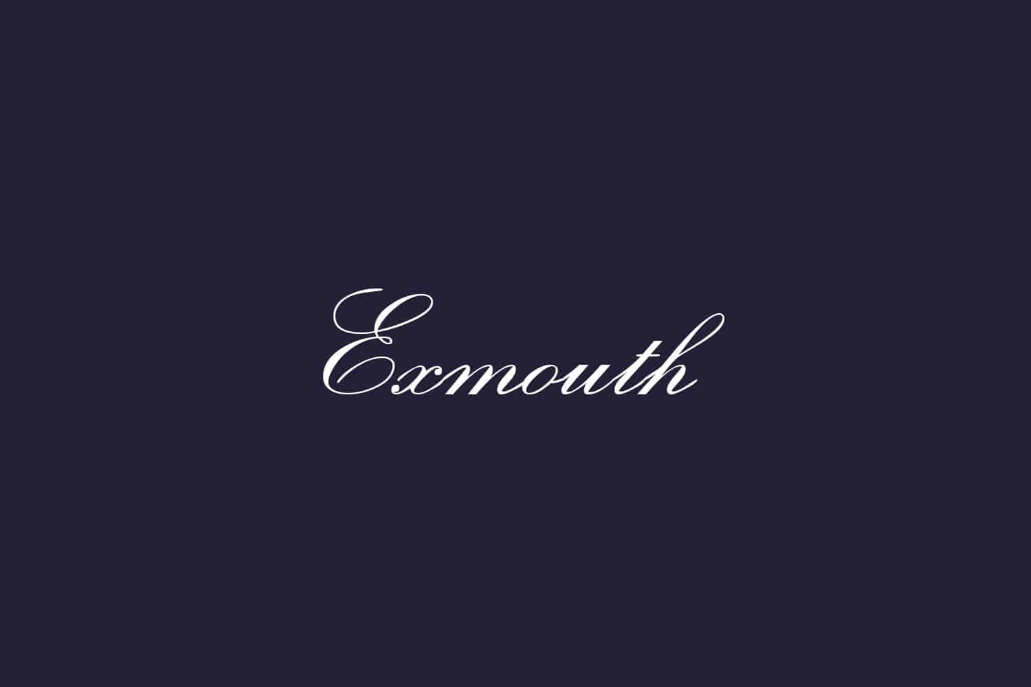
The Exmouth Font is a calligraphy typeface with a clear, flowing brush rhythm. It leans into classic script elegance, but it does not feel too formal or ceremonial. The letters connect with smooth, sweeping joins, and the whole font style suggests quick but controlled hand movement across the page.
The designer is unknown, at least from every source I checked while testing the font. That lack of clear authorship does not change how it works in layout, but it does mean we cannot trace a wider font family or related styles from the same creator. I kept that in mind when planning visual identity systems that might need extended weights or matching sans-serif partners.
The letterforms show a mix of narrow and wide shapes, with long exit strokes that give words a graceful tail. Spacing is on the tighter side, especially in lowercase connections, which helps short words look cohesive but can crowd longer phrases. The rhythm feels lively, leaning slightly right, so the mood is warm, romantic, and a bit playful. As a calligraphy script, it shines in short lines, but it struggles in dense blocks of text where the swashes start to clash and reduce clarity.
Where Can You Use Exmouth Font?
I found the Exmouth Font most comfortable in display roles, like names, titles, and short taglines. At larger sizes, around 36pt and above, the calligraphic curves and subtle contrast in stroke width read clearly. It works well for wedding stationery, event posters, boutique branding, and anything that needs a soft, handwritten elegance.
At medium sizes, such as subheadings or pull quotes, it still holds up, but careful line spacing becomes important. Tight leading makes the loops and tails crash into the next line, so I usually open the spacing a bit more than normal. I tend to pair it with a clean sans-serif for body text to keep the layout balanced and readable for broader audiences.
At small sizes, especially under 16pt, the fine details of the letterforms begin to melt together, and legibility drops fast. For web interfaces or long paragraphs, I avoid it completely and reserve it only for short labels or decorative touches. It suits brands aimed at weddings, beauty, stationery, and personal gifts more than tech, corporate, or serious editorial projects.
Font License
Licensing for the Exmouth Font can vary between sources, so I never assume it is free for every type of project. Before using it in any client work or commercial visual identity, I always check the current licence terms from the official distributor and confirm that both personal and commercial use are clearly allowed.
For me, Exmouth works best as a focused accent rather than a full system workhorse. When used with restraint and paired with a solid text face, it can bring a gentle, human touch to the right project without taking over the whole design.


Leave a Reply