
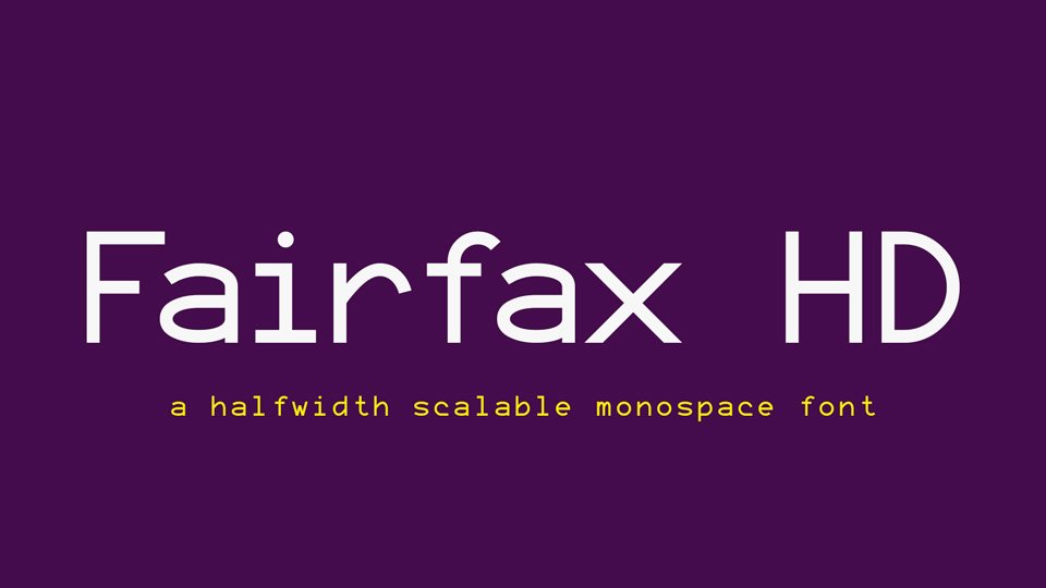

About Fairfax Hd Font
I first tried Fairfax Hd Font while working on a clean dashboard layout for a web app. I needed a calm, readable typeface that stayed neutral but still looked modern and steady. My goal was clear text that did not fight with charts, cards, and buttons.
The more I used it, the more I noticed how balanced it felt on screen. It did not shout for attention, yet it gave the interface a quiet structure. I decided to test it deeper for headings, labels, and tiny UI text, then wrote up my notes for other designers at Free Fonts Lab.
Font Style & Design Analysis
Fairfax Hd Font is a sans-serif typeface with a straightforward, workhorse attitude. The shapes are clean and mostly geometric, but they avoid looking cold or stiff. Strokes feel even, counters are open, and the whole font family leans towards practical clarity rather than strong personality.
The exact creator is not clearly credited, so I will list the designer unknown. That said, the decisions behind the spacing and proportions suggest someone used to interface and long-text design. It feels like a typeface built for screens first, then adapted for print when needed.
The letterforms stay simple: rounded bowls, clear joints, and a steady x-height that helps legibility at small sizes. Spacing is quite even, so text blocks look smooth without strange gaps. The rhythm is calm, which suits data-heavy layouts, manuals, and system UIs. One limitation is personality; this sans-serif will not carry a strong brand voice on its own, so it works best when you want the content, not the typography, to stand out.
Where Can You Use Fairfax Hd Font?
In my tests, Fairfax Hd Font performed best in digital products. It suits dashboards, mobile apps, admin panels, and web platforms where clarity comes first. At medium sizes for menus and buttons, it stays sharp and easy to scan. At large sizes, it works for simple headings, but it will not create a dramatic hero title.
For body text, it handles short to medium paragraphs well, especially on screens. Longer reading, like full articles or reports, is acceptable but not as warm as some humanist options. When I paired it with a more expressive display typeface for titles, the pairing helped. The clean sans-serif body kept things readable while the display face carried the mood.
I would use this font family for tech brands, SaaS products, educational dashboards, or any service that wants a practical, trustworthy feel. It also works for slide decks, internal documents, and design systems. If you rely heavily on icons and colour, this neutral typography steps back nicely and lets the visual identity breathe around it.
Font License
The licence for Fairfax Hd Font can differ between sources, so I never assume it is free for every use. Before any client or commercial project, I always check the official licence details and make sure the allowed usage, number of seats, and redistribution terms are clearly stated.
For me, Fairfax Hd Font is a reliable, quiet tool rather than a star of the show, and that is exactly why it has stayed in my kit.


Leave a Reply