

About Feast Of Flesh Font
I ran into the Feast Of Flesh Font while searching for a loud, horror-style headline for a small poster series. I needed something that felt raw and a bit campy, but still readable from a distance. The name caught my eye first, then the jagged shapes pulled me in.
I decided to test it for a set of fake horror DVD covers that I was building for a typographic exercise on Free Fonts Lab. I wanted a typeface that shouted “B-movie” without looking too polished or modern. This font seemed like a fun tool to push that mood and explore bold, themed typography.
Font Style & Design Analysis
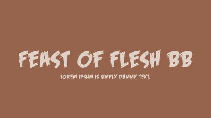
This is a pure display typeface, built for impact rather than quiet reading. The letters look rough, sharp, and torn, as if cut from paper or scratched with a knife. The overall font style leans into horror and grindhouse posters, with heavy strokes that create a strong, chaotic silhouette on the page.
From what I could confirm, the exact creator details are not clearly documented, so I treat it as designer unknown. That lack of background does not change how it behaves in layout, but it does mean I stay extra careful with licensing and attribution whenever I test it in client-facing mock-ups.
The letterforms are wide, uneven, and full of spiky edges, which gives each word a noisy rhythm. Spacing feels tight in places, so I often add a bit of tracking, especially in uppercase headlines. The mood is very niche: playful horror, camp, Halloween, and gore-themed work. It has strong character, but limited flexibility beyond those specific tones, as it can overwhelm softer or minimalist visual identity systems.
Where Can You Use Feast Of Flesh Font?
The Feast Of Flesh Font works best in big display sizes, on posters, covers, or social graphics. At large scale, the scratched edges and rough shapes become a feature, not a flaw. In small sizes, those same details blur, and the text turns muddy, so I avoid using it for body copy or long taglines.
For real projects, I found it useful on Halloween event posters, horror podcast artwork, and fake film branding. It suits audiences who enjoy cult movies, haunted attractions, and themed party visuals. When I pair it with another font family, I usually reach for a clean sans-serif or simple serif, so the wild display shapes have room to breathe.
This display font thrives in layouts with strong contrast: dark backgrounds, bright colours, and simple supporting typography. I like to use it for just a few words, then keep everything else quiet and minimal. Used this way, it becomes a clear focal point rather than a gimmick. The key is restraint: one loud element, supported by calm, readable text around it.
Font License
Licensing for the Feast Of Flesh Font can vary depending on the source, so I never assume it is free for commercial work. I always check the official licence terms before using it in paid projects, and I recommend you confirm usage rights for both personal and client use. My rule is simple: verify first, design second.
My honest take as Ayan Farabi: this font is a fun, loud tool for horror-themed designs, as long as you use it sparingly and with clear intent.


Leave a Reply