

About Ff Mark Font
I first tried Ff Mark Font while working on a clean, modern poster for a tech event. I needed a voice that felt confident but not cold, and this typeface kept showing up in my research. Its calm geometry and neat rhythm made me curious enough to give it a proper test at Free Fonts Lab.
What drew me in was the balance between strict structure and quiet personality. The shapes look simple, but the details feel carefully tuned. I wanted to see how this font family behaved in real layouts, both tight grids and more open, editorial pages.
Font Style & Design Analysis
Ff Mark Font is a sans-serif typeface with a very controlled, geometric look. The circles feel close to perfect, and the straight lines are firm and sharp. It gives a strong sense of order, which suits modern brands and clean user interfaces that rely on clear, direct typography.
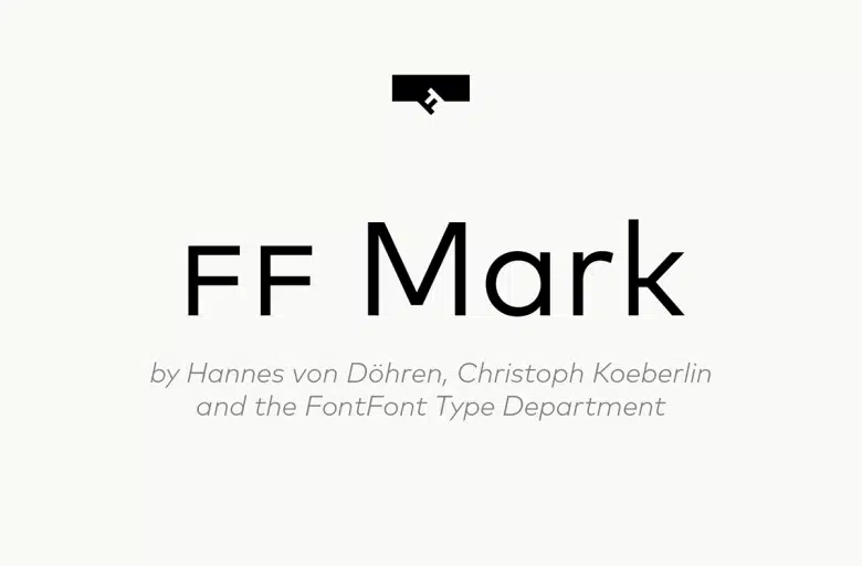
The font comes from FontFont, designed by Hannes von Döhren, Christoph Koeberlin, and the FontFont Type Department. Knowing this team’s history with functional typefaces helped me trust the font in more serious design tasks, like corporate decks, wayfinding, and structured editorial work.
The letterforms have wide counters and open apertures, which keep text readable, even at smaller sizes. Spacing feels even and calm, with a steady rhythm across words and lines. The mood is confident, neutral, and slightly technical. Its strength lies in clarity and consistency, though it can feel too restrained for playful or very expressive visual identity projects.
Where Can You Use Ff Mark Font?
I find Ff Mark Font most at home in branding systems that need a modern, stable tone. Tech companies, architecture studios, and product brands can all use this sans-serif as a core typeface. It works well in logos built from simple wordmarks, especially when a straight, efficient voice is needed.
At large sizes, the clean geometry really shines. Headlines, posters, and landing page hero text feel bold and direct, without shouting. In small text, the open shapes help with readability, but I usually avoid very long paragraphs in this font style. For long reading, I often pair it with a softer serif to rest the eye.
In interface design, the font works nicely for navigation labels, buttons, and short instructions. Pairing it with a contrasting display face can add character to titles while keeping body text steady. When I design grids, this font family supports tight, modular layouts and keeps spacing predictable, which makes complex systems easier to manage.
Font License
The licence for Ff Mark Font can differ by source and intended use. Some licences cover only personal work, while others include commercial projects or web use. I always recommend checking the official licence details before using it in client work or large branding systems.
My honest takeaway as Ayan Farabi: this font rewards structured design. If your project values order, clarity, and a modern voice, it is a reliable tool, as long as you pair it with something more expressive when emotion matters.


Leave a Reply