

About Formula One Font
I came to the Formula One Font while building a clean racing logo for a motorsport event. I needed a fast, sharp wordmark that still felt controlled and modern. Many options looked either too playful or too cold, so I kept digging until this typeface caught my eye.
The first thing that struck me was its focus on speed without messy details. It looked like something built for a bold pit-lane sign, not a casual headline. I decided to test it in a few mock logos for a client and later used it again in a study piece for Free Fonts Lab.
My early tests were simple: single-word logos, short taglines, and timing boards. Seeing it in motion graphics and static layouts showed me where this font family shines and where it needs more care.
Font Style & Design Analysis
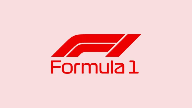
The Formula One Font is a pure logo typeface, and that focus shapes every detail of its design. The letters sit low and wide, with tight curves and angled cuts that suggest movement. It feels engineered, like track lines and car bodies turned into typography, ready to sit on a nose cone or race banner.
The exact creator of this font is designer unknown, which makes its origin a bit of a mystery. Still, the design choices feel deliberate. The strokes are thick, the counters controlled, and the edges crisp. Nothing here looks random; it reads like someone studied racing graphics and then built a custom mark from that visual language.
The letterforms have a strong rhythm, especially in characters like E, F, and R, which share similar cuts. Spacing is tight but not cramped, which helps when setting short names or car numbers. The mood is serious, fast, and technical. It works well for bold branding, but it is not flexible for long text or small captions. As a logo font style, it excels in short bursts and loses clarity in dense paragraphs.
Where Can You Use Formula One Font?
I find the Formula One Font most useful in projects where speed and precision are key parts of the visual identity. Motorsport branding, eSports teams, energy drink labels, and racing event posters are natural fits. It also works well on digital dashboards, streaming overlays, and hero titles in teaser videos.
At large sizes, the font looks strong and confident. The angled cuts and tight shapes stand out on cars, helmets, and banners. On small screens or tiny labels, though, the heavy strokes can blur, and some letters merge visually. I tend to avoid it for small body text or dense UI elements, keeping it instead for headlines and core marks.
When I pair this typeface, I usually match it with a simple sans-serif for body copy, something neutral that does not fight for attention. Clean spacing, generous margins, and short words help it breathe. If you treat it like a hero logo font rather than an all-purpose workhorse, it rewards you with a very focused, high-impact look.
Font License
The licensing for the Formula One Font can vary, especially between personal and commercial projects. I always check the official source before using it in client work or large campaigns. If you plan paid or wide distribution use, read the terms carefully and keep a record of the licence details.
For me, this font works best as a sharp, specialised choice when a project needs clear racing energy without losing control.


Leave a Reply