

About Frankfurt Font
I first tried the Frankfurt Font while working on a bold event poster that needed a loud, confident headline. I wanted something with presence, but not a cliché retro look. As I browsed options for Free Fonts Lab, this typeface stood out because it felt simple yet striking.
The heavy forms and clear shapes looked perfect for short, punchy words. I tested it in different colour schemes and layouts to see how it handled hierarchy and contrast. It gave me strong visual weight without getting messy, which made me curious to explore it more in real projects.
Font Style & Design Analysis
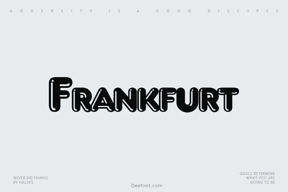
This is a pure display typeface, and it shows that intent right away. The letters are wide, bold, and built for attention, not long reading. The overall font style feels structured and compact, almost like old poster lettering, but with a clean, digital sharpness that suits modern layouts.
The exact creator of this font appears to be designer unknown, at least from the sources I checked. That sometimes happens with older or widely shared display fonts. Even without a clear name behind it, the font family carries a distinct voice that suggests a background in signage or headline typography.
The letterforms are heavy, with tight counters and short strokes that pack a lot of black into each glyph. Spacing runs on the tighter side, which helps for big titles but can feel cramped in long words. The rhythm feels blocky and strong, giving a firm, solid mood. It works very well for impact, but less so for dense text or small captions. As a display font, its strength is clear, loud messaging in limited doses.
Where Can You Use Frankfurt Font?
In my tests, this typeface made the most sense in posters, banners, and social media graphics. At large sizes, the Frankfurt Font delivers strong readability with a powerful silhouette. It suits events, music flyers, sports graphics, and any project where the headline must win attention from a distance.
On screens, it holds up well for hero text, thumbnails, and bold calls to action. At smaller sizes, the tight shapes and heavy strokes start to blur, so I would not use it for body copy or UI text. I often pair it with a clean sans-serif or a neutral serif for supporting paragraphs, so the main headline can stay loud while the rest remains comfortable to read.
For branding, I see this font working for clubs, local events, streetwear labels, and bold food or drink brands. It gives a solid, slightly retro block feel that can support strong visual identity systems. When used with plenty of spacing and simple layouts, the Frankfurt Font can anchor a design without needing extra graphic effects.
Font License
The licensing for this typeface can vary between sources, so I never assume it is free for every use. Before using Frankfurt Font in commercial work, always read the licence terms from the original provider and confirm what is allowed for personal, client, and large-scale projects.
For me, this font is a useful, focused tool: great when I need a heavy, attention-grabbing headline, as long as I keep it large, simple, and used with care.


Leave a Reply