
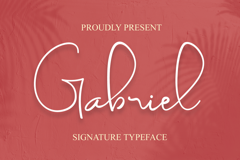

About Gabriel Font
I came to the Gabriel Font while working on a wedding invitation set for a calm, modern couple. They wanted something soft, handwritten, but not childish. As I browsed script options, this one felt balanced enough for both print and digital use.
I decided to test it across titles, names, and short quotes. The curves looked friendly, and the strokes had a steady flow that caught my eye. For the review at Free Fonts Lab, I also checked how it behaved in different layouts and colour palettes, to see if it stayed readable and elegant under pressure.
Font Style & Design Analysis
The Gabriel Font is a script font, and it leans towards a smooth, semi-formal handwritten style. The letters connect with gentle strokes that feel controlled rather than wild. It does not scream for attention, but it adds a clear sense of warmth and personality to any headline or name.
The designer of this font is designer unknown, which means I had to judge it only by function and feel. There is no heavy branding story around it, and in a way, that helped. I focused on the actual letterforms, spacing, and behaviour in real layouts instead of a marketing narrative.
The letterforms have rounded terminals and modest contrast between thick and thin strokes. The rhythm is steady, so words look even and not jumpy. Spacing is fairly tight, which works for large titles but can feel cramped in long lines. The mood sits between casual and formal. It shines in names, quotes, and short phrases, but it is not ideal for dense paragraphs or tiny captions.
Where Can You Use Gabriel Font?
In my tests, the Gabriel Font worked best for wedding stationery, event posters, and personal branding marks. At large sizes, the script shapes feel graceful and confident. You can see the flow of each stroke clearly, which adds a nice human touch to titles and logos.
At medium sizes, such as social media graphics or packaging labels, it still reads well if you give it enough line spacing. I would avoid using this script font below 14–16 points for body text, as the tight joins start to blend. It can pair well with a clean sans-serif font family for body copy, creating a clear visual hierarchy.
For audiences, it suits brands that want to feel friendly, personal, and slightly romantic without going too decorative. I used it with muted colour palettes and simple layouts, and it stayed calm rather than flashy. It can fit lifestyle blogs, beauty products, small cafés, and crafted goods where a soft handwritten typography style feels natural.
Font License
The licensing terms for the Gabriel Font can change depending on where you download it. Before using it for client work, packaging, or large commercial projects, always review the official licence details. I recommend checking the current usage rights carefully to confirm what is allowed for both personal and commercial use.
For me, the Gabriel Font is a gentle, practical script that works when I need warmth without drama. I reach for it when a project calls for handwritten character, but still needs to stay clear, readable, and calm.


Leave a Reply