

About Gabriel Sans Font
I ran into Gabriel Sans Font while working on a clean brand refresh for a tech client. I needed something modern, but not cold or sharp. Many popular options felt overused, so I kept digging through different font families until this one caught my eye.
The first thing that pulled me in was its calm, balanced voice. The shapes looked friendly but still professional, which fit the brief very well. I decided to test it in headings, body text, and UI labels. For me, that is the real way to see if a typeface holds up beyond the simple preview you see on a site like Free Fonts Lab.
Font Style & Design Analysis
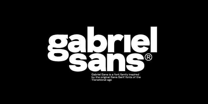
Gabriel Sans Font is a sans-serif typeface with a clean, geometric base and soft details. Strokes feel even and controlled, but not stiff. The overall design leans modern, with open counters and simple shapes that keep the page looking light. It aims for a neutral voice, yet it still has enough character to stand out gently in a layout.
The designer of this font is currently listed as designer unknown, which is fairly common with many shared typefaces online. Without a clear foundry or author name, I always judge it more by its craft and consistency. In this case, the spacing, curve quality, and general build feel considered, not rushed, which gave me more confidence to use it in real visual identity work.
The letterforms show a clear focus on clarity. The lowercase shapes stay simple, and the x-height feels generous enough for screens. Spacing is slightly loose by default, which helps readability, especially for longer copy. In headings, I sometimes tighten the tracking a bit to get a stronger rhythm. The mood is modern, friendly, and steady. The main limitation I noticed is that it can feel too quiet for very expressive posters, but as a core sans-serif workhorse, it does its job well.
Where Can You Use Gabriel Sans Font?
I found Gabriel Sans Font most comfortable in brand systems that need a clear, trustworthy tone. It works nicely for tech, education, health, and light corporate projects where you want a modern look without harsh edges. Large titles on landing pages feel clean and readable, especially with generous spacing and simple colour palettes.
In smaller sizes, such as UI labels, menus, and captions, the open shapes keep text easy to scan. On screens, the typeface holds its clarity quite well, which is not always the case with many free fonts. For print, it handles brochures, simple reports, and product sheets without much adjustment. I would avoid very dense legal text, but short to medium-length copy looks fine.
For pairing, I like using this font family as the main sans next to a subtle serif for highlights or quotes. It also pairs with light script accents if you keep them minimal. In layout work, I recommend using a bold weight for headings, a regular weight for body text, and keeping the hierarchy clear. When used with enough white space, the font style supports a calm, ordered reading experience that suits a wide range of audiences.
Font License
The licence for Gabriel Sans Font can vary depending on where you download it from. Some sources may allow personal use only, while others may offer commercial rights. I always suggest reading the official licence text carefully and confirming terms before using this typeface in client work or paid projects.
If you like quiet, modern typography that does not fight the content, this font is worth testing. For me, it has become one of those reliable options I keep in mind when a project needs a clear voice without visual noise.


Leave a Reply