

About Gabriola Font
I first reached for the Gabriola Font during a packaging mockup for a small handmade soap brand. The client wanted something graceful but still readable, with a feeling of quiet drama. I remembered seeing this typeface inside Windows, so I decided to give it a proper test instead of ignoring it again.
What kept me interested was the mix of flowing curves and tall, elegant shapes. It looked like it could handle poetic headlines, menus, and event titles without feeling cheap or noisy. For Free Fonts Lab, I spent more time exploring its OpenType features and stylistic sets, testing how far I could push the style in real layouts.
Font Style & Design Analysis
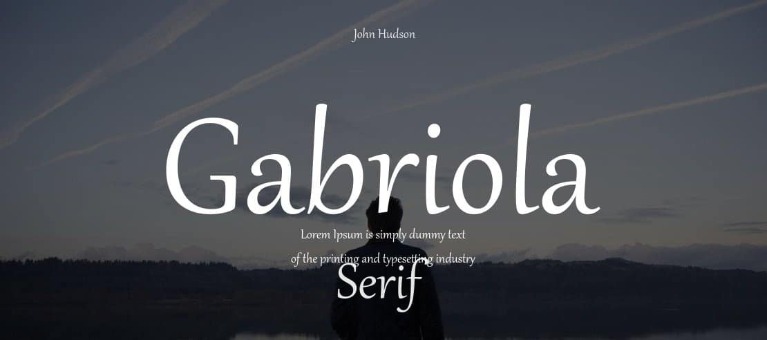
Gabriola Font is a display typeface with a strong calligraphic mood and a very decorative voice. The strokes flare gently, the curves feel almost hand-brushed, and the terminals often end in dramatic sweeps. It is not shy at all; it wants to be seen, especially in short, expressive words or poetic lines.
The typeface ships with Microsoft products and is credited to type designer John Hudson for Microsoft Typography. His work usually balances historical calligraphic influence with careful digital refinement, and that shows here. The font family includes several stylistic sets that shift the tone from calmer shapes to more ornamental alternates.
The letterforms have high contrast between thick and thin strokes, which gives strong rhythm but can make very small text fragile. Spacing feels generous, so words breathe nicely in headings, especially with more tracking. The mood sits somewhere between formal and romantic, making it strong for invitations and quotes. As a display font, it struggles in dense paragraphs or technical interfaces, where its flourishes start to distract and reduce clarity.
Where Can You Use Gabriola Font?
In my tests, Gabriola Font worked best in large sizes, where the swashes and curves have room. Wedding invitations, event posters, book covers, and poetry spreads all benefit from its expressive shapes. It suits audiences who enjoy a touch of drama and elegance, rather than strict minimalism or very modern branding.
At medium sizes, such as menu titles, product labels, and section headers on a website, it stays readable if you keep the text short. Pairing it with a clean sans-serif or a calm serif body typeface helps balance the layout. I usually let Gabriola handle the emotional words, while the supporting font family keeps information clear and steady.
At small sizes, its high contrast and delicate details start to break down, especially on low-resolution screens. I avoid using it for body text, captions, or UI labels. Instead, I treat it purely as a display accent: quotes on social media graphics, logotypes for artisanal brands, or highlight lines in editorial design where typography can carry mood.
Font License
The licensing for Gabriola Font depends on how you access it, for example through an operating system or another bundle. Terms can change, so do not assume it is free for every commercial use. Always review the current licence from the official source before using it in client work or large projects. For me, it is a characterful tool when I want expressive, decorative typography in controlled doses.


Leave a Reply