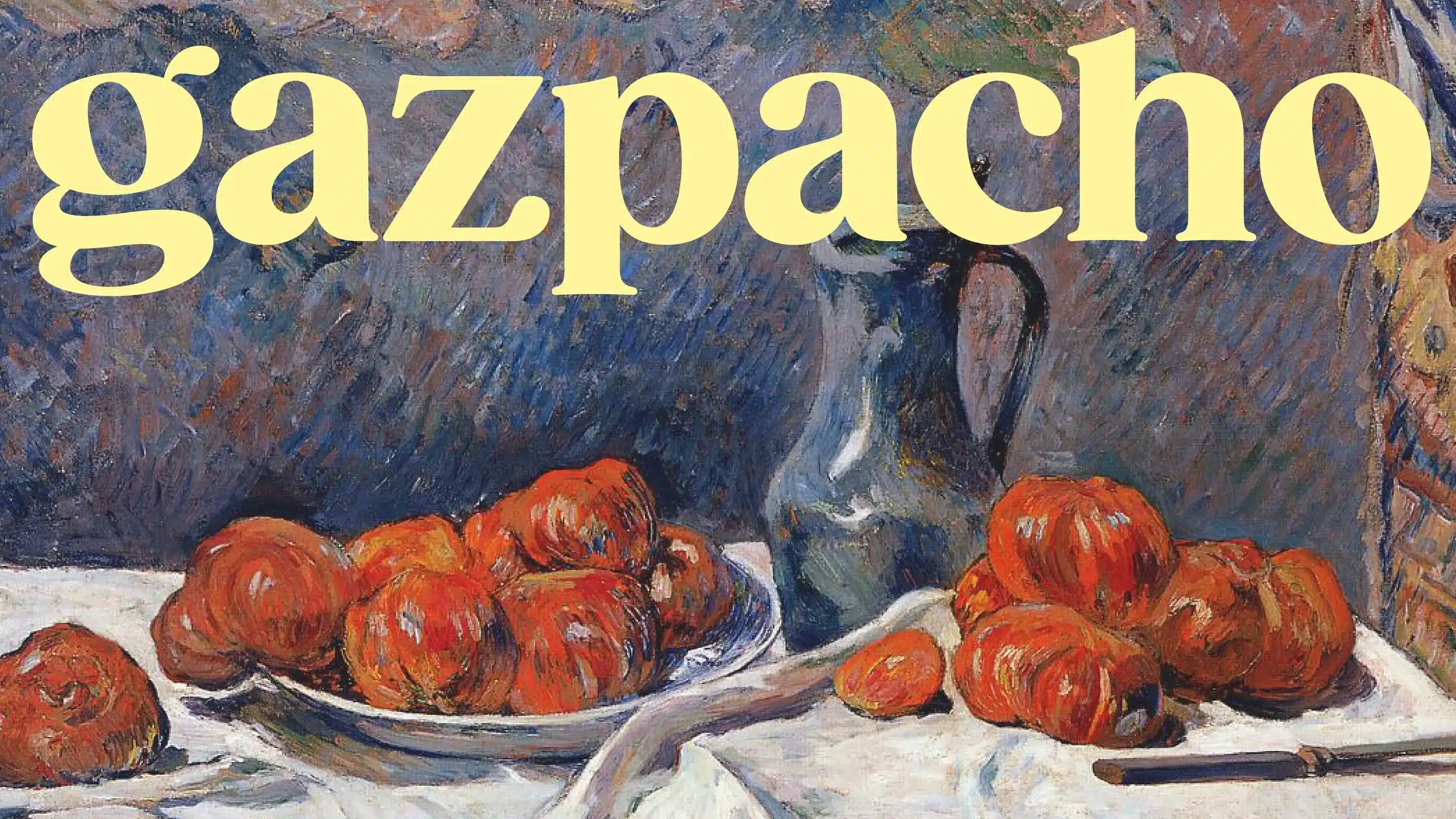
About Gazpacho Font
I first tried the Gazpacho Font while working on a print layout that needed a strong bookish mood. I wanted something classic, but not stiff or cold. This serif typeface caught my eye because it felt warm and confident at the same time.
The shapes looked friendly enough for wider audiences, yet serious enough for long reading. That balance made me curious. I tested it in headings, pull quotes, and short paragraphs, then shared the results with our readers at Free Fonts Lab to see how it behaved in real layouts.
Font Style & Design Analysis
This is a serif font with a clear, modern book flavour. The strokes feel carefully balanced, with noticeable contrast between thick and thin parts. The curves are smooth and rounded, so the font style never feels harsh on the page. It gives a gentle literary tone, rather than a strict, academic one.
The designer is unknown, but the work shows a thoughtful eye for readable typography. The font family feels planned for actual use, not just for show. The proportions follow classic text faces, yet some details feel slightly playful. That mix suggests a designer who respects tradition but is not afraid to soften it.
The letterforms have open counters, which helps lines breathe nicely. Spacing is even and calm, giving a steady reading rhythm. In headings, the high contrast gives strong visual identity and focus. In smaller text, it stays readable, though very tiny sizes may need careful line spacing. The Gazpacho Font shines in editorial, branding, and packaging, but it is less ideal for dense data tables or UI labels.
Where Can You Use Gazpacho Font?
I see the Gazpacho Font working best in projects that need both charm and clarity. Book covers, literary magazines, and story-driven websites are natural fits. It gives a human tone without turning casual. For brand work, it suits boutique shops, cafés, studios, and cultural projects that want a thoughtful, crafted feel.
At large sizes, this serif font shows off its curves and contrast very well. Headlines, posters, and hero banners feel expressive and inviting. At medium sizes, like pull quotes or short articles, it keeps a smooth reading flow. For body copy, I would use it from around 11–12 pt upwards, with slightly generous line spacing.
For pairing, I like it with a clean sans-serif for captions, menus, or UI elements. That contrast keeps layouts clear while letting the serif carry the main voice. You can also mix weights within the same font family for a more classic book look. Used with moderation, Gazpacho Font can become the typographic anchor of a whole visual system.
Font License
The licence for Gazpacho Font can change depending on the source, so it is important to check details before use. Do not assume it is free for commercial work. Always review the official licence terms for both personal and client projects, and keep a copy for your records.
After testing it in real layouts, I see Gazpacho as a reliable serif choice when I want warmth, control, and a quiet literary voice in my designs.


Leave a Reply