
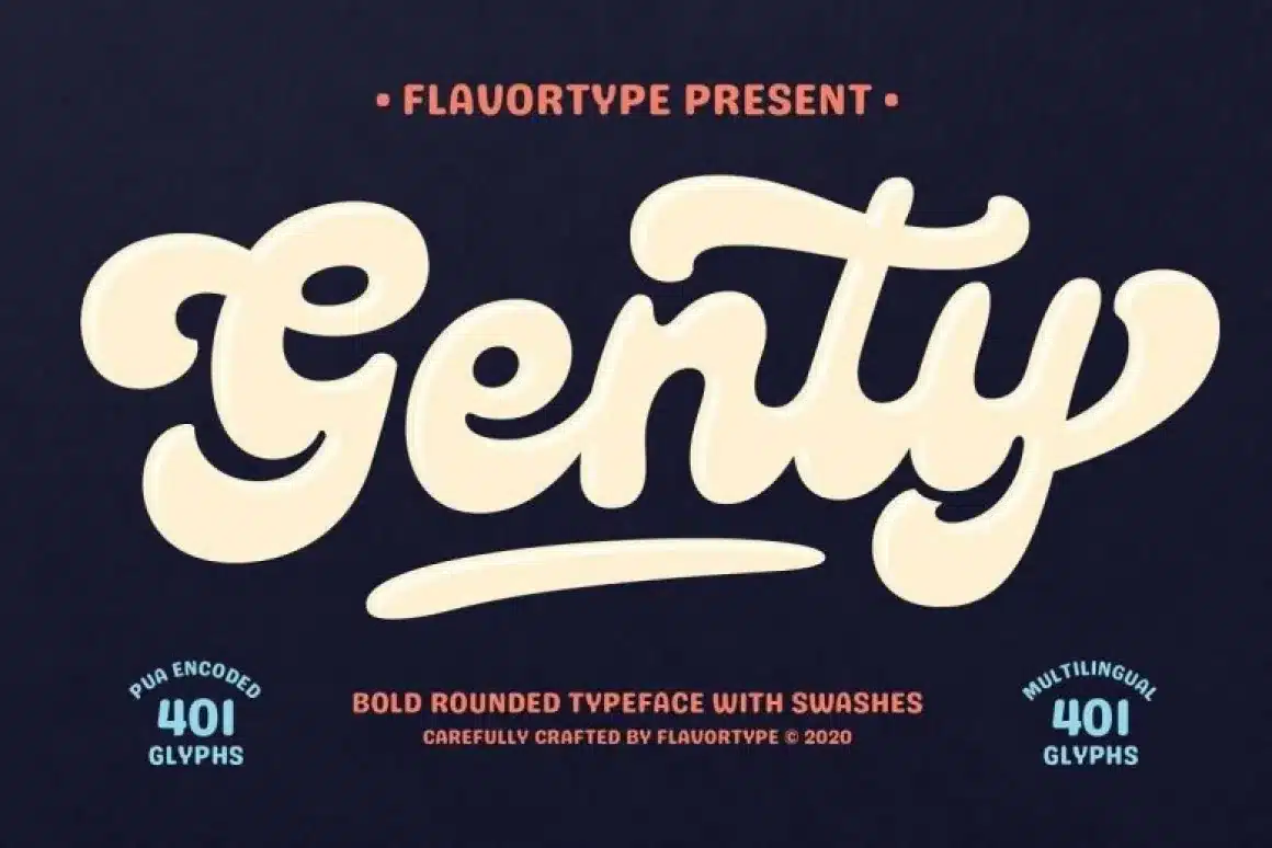

About Genty Font
I first tried Genty Font while working on a playful logo for a kids’ craft brand. I needed a script typeface that felt fun, bold, and friendly, but still clear enough for quick reading. The rounded shapes and bouncy rhythm caught my eye, so I decided to test it in a real layout.
During that project, I explored how the font behaved in different weights, colours, and backgrounds. I paid close attention to legibility and balance inside a full visual identity system. For Free Fonts Lab, I then rebuilt a few mock social posts, posters, and packaging labels to see how this font style holds up in everyday use.
Font Style & Design Analysis
Genty Font is a bold script typeface with a strong, rounded brush feel. The letters look smooth and soft, almost like bubble writing, but with better control and structure. Strokes are thick, curves are generous, and the whole font family leans towards a cheerful, cartoon-like mood that still feels designed, not messy.
The designer is not clearly credited, so I would list it as designer unknown when documenting a project. That said, the craft suggests a designer who understands brand-heavy applications. The weight, contrast, and connections between letters feel deliberate, which is important when you rely on one script font to carry a whole headline or logo.
The letterforms have wide counters and a fairly even rhythm, so big words stay readable. The spacing is tight by default, as many script fonts are, but not overly cramped. I often nudged tracking slightly for longer words. The mood is fun, youthful, and informal, which works well for playful brands. Its limitation is tone: it does not suit serious, luxury, or minimalist aesthetics.
Where Can You Use Genty Font?
I see Genty Font working best in display roles: logos, headlines, banners, and big social graphics. At large sizes, the rounded script curves show their full character and bring strong personality to a layout. It fits kids’ products, snacks, gaming, cartoons, and any brand that leans into joy and energy.
At smaller sizes, like body text or small labels, the connected script shapes become harder to read. I would avoid using this script for long paragraphs or detailed instructions. Instead, I pair it with a clean sans-serif for body copy. The contrast between a calm secondary typeface and this expressive script creates a clear hierarchy and keeps designs tidy.
On packaging, it works nicely for flavour names, taglines, or callouts placed on coloured blobs or badges. For social media, I like it for short, bold words on simple backgrounds, especially in bright palettes. When I use this script font in branding, I keep the rest of the typography system minimal, so the hero wordmark remains the main visual voice.
Font License
Before using Genty Font in any paid or client project, I always check the official licence from the original source. Personal and commercial permissions can change over time, so it is safer not to assume anything. Read the terms carefully, especially for logo use, web embedding, and large-scale campaigns.
My own takeaway: I reach for this font when a project needs loud, friendly script energy, but I keep it as a display accent and support it with simpler type.


Leave a Reply