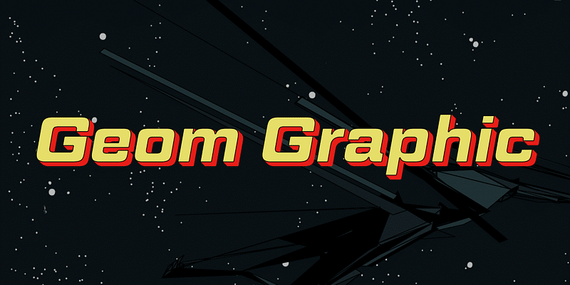
About Geom Graphic Font
I came across the Geom Graphic Font while I was searching for a clean serif option for a simple poster series. I wanted something neat and modern, but still with a classic base. The name suggested geometry and structure, which made me curious enough to test it in a few layouts.
I tried it first on a set of event titles and short paragraphs. The font felt calm and tidy, without trying too hard to stand out. That balance made me want to explore it deeper for Free Fonts Lab and see where it actually works and where it starts to struggle.
Font Style & Design Analysis
Geom Graphic Font is a serif typeface with a clear geometric influence. The structure feels planned and measured, with even strokes and regular shapes. It leans towards a modern look, but it still keeps that grounded feeling we expect from a serif font. The overall impression is steady, controlled, and slightly minimal.
The designer is unknown, at least from the sources I could trace with confidence. That sometimes happens with fonts that move across many sites and archives. Without direct notes from the creator, I had to rely fully on visual reading and practical testing to understand the intent behind the font family.
The letterforms have straight, almost mechanical curves and compact serif details. Spacing is on the tighter side, which works well for headlines but needs care in longer text. The rhythm feels quite even, which gives a calm tone but can also feel a bit stiff in very text-heavy layouts. Its strength lies in short to medium copy, where clarity and order matter more than expressive personality.
Where Can You Use Geom Graphic Font?
In my tests, Geom Graphic Font worked best in titles, pull quotes, and short blocks of copy. At larger sizes, the serif details and geometric balance come through clearly. It suits editorial covers, posters, simple brand systems, and clean social graphics where you want a neat, structured voice.
At smaller sizes, the tighter spacing and sharp serif cuts need attention. For long reading text, especially on screen, it can start to look a bit dense. If you plan to use it for body copy, generous line spacing and slightly larger point sizes help. I found it more comfortable in print than in long digital articles.
For pairing, I had good results combining this serif with a soft sans-serif that has round shapes and open counters. That mix keeps the page from feeling too rigid. Use Geom Graphic Font for headings or subheads, then bring in the supporting sans-serif for body text. This balance gives structure without losing warmth in the visual identity.
Font License
The licence terms for Geom Graphic Font can vary depending on the source where you obtain it. Before using it in client work or commercial projects, always check the official licence details. For personal experiments, tests, or mock-ups, read the usage notes carefully so your typography stays both creative and legally safe.
After living with it in a few layouts, I see Geom Graphic Font as a steady, structured serif that works well when you need order and clarity, as long as you handle size and spacing with care.


Leave a Reply