

About Geometria Font
I came to Geometria Font while testing clean type options for a digital product dashboard. I needed something modern, clear, and neutral, but not cold. Many popular choices felt either too strict or too quirky, so I wanted a middle ground that still felt designed.
During that project, this font caught my eye because of its geometric base and soft corners. It promised structure without stiffness. I tried it in headings, labels, and data tables, and it held together well. Later, I wrote this review for Free Fonts Lab to share how it behaved in real layouts.
Font Style & Design Analysis
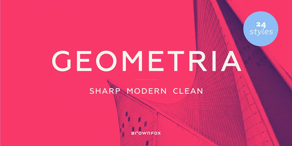
Geometria Font is a sans-serif typeface with a clear geometric skeleton. Circles, straight lines, and simple shapes lead the structure of each letter. Yet it avoids feeling too mathematical, thanks to gentle curves and well-balanced proportions that keep the font readable and friendly at many sizes.
From what I could confirm, the exact original designer and foundry information is not fully clear to me, so I would list it as designer unknown for now. That said, the design direction fits the broader family of modern geometric sans-serif fonts that we often see in UI, tech, and brand work.
The letterforms feel stable, with even stroke widths and careful spacing. The rhythm is calm, which makes long lines of text easier on the eyes. Rounded shapes like “o” and “e” sit comfortably next to straighter letters like “n” and “t”. The main strengths are clarity and consistency; the limitation is that it can feel a bit plain in very expressive or artistic layouts.
Where Can You Use Geometria Font?
I find Geometria Font most useful in interfaces, dashboards, and product websites. It works well for navigation, buttons, charts, and labels because the shapes are simple and easy to scan. At medium sizes, the font gives a clean, professional voice without drawing too much attention to itself.
In larger display sizes, such as hero headlines or posters, it looks sharp but not overly loud. Pairing it with a more expressive display or serif font can add character while keeping the main message clear. For body text, it works best in short to medium paragraphs, where its geometric nature stays comfortable and does not feel tiring.
For brand systems, I would reach for this font family when a client needs a modern, neutral, and tech-leaning visual identity. It suits startups, apps, education platforms, and simple corporate material. When pairing, I usually combine it with a warmer serif or a humanist sans to balance its clean, structured look.
Font License
The licence for Geometria Font can vary depending on the source, so it is important not to assume anything. Always check the official licence terms for personal and commercial use before using it in client work, apps, or large campaigns. I always verify this step before locking it into a brand system.
For me, this typeface sits in a useful middle zone: honest, clear, and steady. When I need a reliable geometric base that does not fight the design, I keep Geometria close at hand.


Leave a Reply