
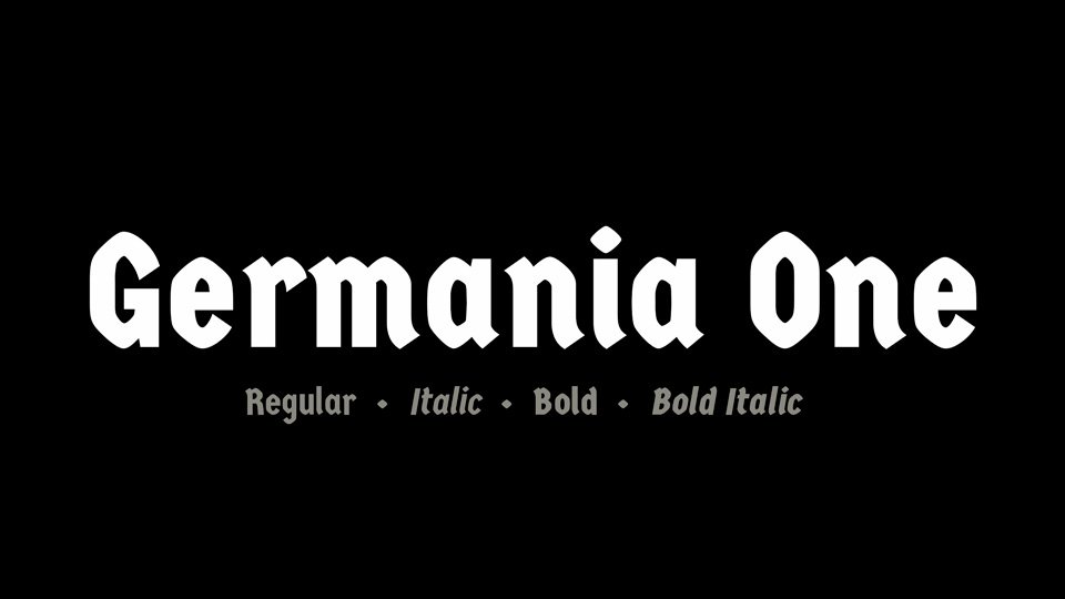

About Germania One Font
I first reached for the Germania One Font while building a set of poster concepts for a metal and folk music event. I needed something bold, dark, and readable, but not a full medieval cliché. The name caught my eye, and the shapes felt strong without looking cheap or overdone.
As I tested it across titles and short phrases, the font gave the artwork a firm voice very quickly. It added weight and attitude with little effort. I later wrote notes about it for Free Fonts Lab, because I felt other designers might face the same search for a heavy, characterful display face that still stays usable.
Font Style & Design Analysis
Germania One Font is a display typeface with a clear gothic flavour and rigid structure. The strokes are thick and compact, with tight curves and sharp angles. It sits somewhere between modern blackletter-inspired design and strong headline typography, which makes it feel dramatic but still controlled and tidy on the page.
The font is credited to John Vargas Beltrán, who shaped it with a very focused idea in mind. You can sense a careful balance between traditional German-style forms and simpler contemporary construction. The result is a font family that respects historical influence, but strips away tiny flourishes that would slow reading in today’s layouts.
The letterforms have wide vertical strokes, narrow counters, and a strong horizontal base line. Capitals feel heavy and stable, while the lowercase gives a bit more rhythm and flow. Spacing is tight, which helps in big headings but can feel crowded in long text. As a display font style, it shines in short bursts: titles, logos, badges, or large labels. It struggles in dense paragraphs or anywhere fine detail and subtle tone are needed.
Where Can You Use Germania One Font?
I find Germania One Font most effective in posters, covers, and branding that need impact and edge. Music events, gaming graphics, beer labels, and sports logos all fit its voice. It gives a clear, strong visual identity when you want something dark, but not fully ornamental blackletter. It feels assertive rather than decorative.
At large sizes, the typeface holds up very well. The bold strokes and simple structure stay clean on screens and in print. When you reduce it too much, the inner shapes start to close, and letterforms blur together. For small captions, menus, or body copy, I pair it with a calm sans-serif or serif workhorse and keep Germania One Font only for key words.
It works well for audiences that enjoy strong, themed visuals: fans of metal or rock, historical games, fantasy content, or craft brands with a rugged feel. I often use it in a limited palette, maybe all caps for main headings, then switch to a neutral font family for supporting text. Careful line spacing and generous margins help the heavy forms breathe and prevent the layout from feeling cramped.
Font License
From what I have seen, Germania One Font is commonly shared as a free typeface, but licence terms can change. I always suggest checking the current licence on the official source before using it in client work or products. Treat personal and commercial projects with the same care and confirm that your planned use is clearly allowed.
My simple takeaway as Ayan Farabi: use this font when you need bold mood in short, sharp moments, and give it space to speak.


Leave a Reply