

About Gg Sans Font
I came across Gg Sans Font while I was testing type options for a calm, friendly app interface. I needed something modern, clean, and not too “techy”. Many popular options felt either too sharp or too playful, so I started looking for a softer voice in a simple sans.
The first thing that caught my eye was its relaxed geometry. The shapes felt open and approachable, without looking childish. That balance made me curious enough to try it in a real layout. I dropped it into some sample screens for Free Fonts Lab and started checking how it behaved at different sizes and weights.
What kept me working with it was how steady it looked in longer text. Nothing jumped out or shouted for attention. It just supported the content, which is what I want from a daily-use sans in digital products.
Font Style & Design Analysis
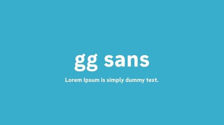
Gg Sans Font is a sans-serif typeface with a clean, rounded feel and simple, modern shapes. The basic structure leans on clear geometry, but the corners feel slightly softened. This gives the font family a friendly tone that still looks professional. It sits comfortably between strict corporate and playful display styles.
The exact creator of this typeface is designer unknown, at least from the sources I could access. That lack of clear authorship does not change how it behaves in real design work, but it does mean I stay a bit more careful about licensing checks. From a practical view, though, the font style shows a considered approach to spacing, weight steps, and basic proportions.
The letterforms use moderate x-height and open counters, so text remains readable even at smaller sizes. Spacing feels even, with a smooth rhythm in both headlines and body copy. Curves on letters like “a”, “e”, and “s” give a soft mood, while straight strokes keep things grounded. It performs well in UI text, subheadings, and short paragraphs, but it is not ideal for very dense documents where a more neutral sans-serif might be easier on the eye across many pages.
Where Can You Use Gg Sans Font?
I found Gg Sans Font most useful in digital interfaces and light editorial layouts. In larger sizes, such as headers or feature titles, its rounded simplicity feels clear and confident. It works well on clean landing pages, app dashboards, and product screens where you want warmth without losing clarity.
At smaller sizes, like labels or UI microcopy, the open letterforms keep text readable, though I avoid very tight line spacing. It suits tech products aimed at a broad, non-expert audience, education platforms, and lifestyle brands. Paired with a simple geometric sans or a subtle serif for contrast, it can support a strong, flexible visual identity.
For branding, I would use it for friendly logotypes, tagline text, and packaging with minimal graphics. It speaks best when layouts are simple and clean. Complex, highly expressive posters might ask for a bolder display face, with Gg Sans Font taking the role of supporting text, buttons, and navigation labels.
Font License
Before using Gg Sans Font in client work or commercial projects, I always check the licence details from the original source. Usage rights can change, so do not assume it is free for all purposes. Make sure personal, commercial, web, and app use are clearly allowed for your specific case.
For me, this typeface works best when I need a calm, modern voice that stays out of the way and lets the design breathe. When I want quiet clarity in a sans, I keep this one in mind as a practical option.


Leave a Reply