

About Ghasty Panic Font
I came across the Ghasty Panic Font while searching for a spooky title style for a seasonal poster set. I needed something loud, a bit silly, but still readable from a distance. The name caught my eye first, then the rough, scratchy shapes pulled me in.
I tested it on a small Halloween event series for a local cafe, then later mocked it up for a Free Fonts Lab review. In both cases, I wanted a font that felt playful and creepy without going too dark. This typeface sat nicely between fun and horror, which made me curious to explore it more.
Font Style & Design Analysis
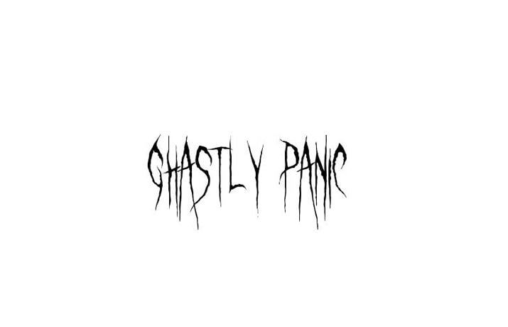
This is clearly a halloween display typeface, built to shout rather than whisper. The letters look jagged and distressed, like they were carved fast with a knife or scratched on an old wall. The overall font style leans into horror themes, but there is a cartoon energy that keeps it approachable.
The designer of Ghasty Panic Font is designer unknown, at least from what I could verify through typical font sources. Because of that, I treated the font family as a standalone experiment rather than part of a larger, managed collection. It feels like a one-off creative piece made just for spooky visuals.
The letterforms are tall, irregular, and full of sharp edges. Curves often break into angles, which adds nervous movement to the text. Spacing is quite tight, so lines of text feel dense and chaotic, especially in all caps. This works nicely for short headlines, but long sentences can feel heavy. The rhythm suits horror posters, game covers, and party flyers, yet it is not ideal for small captions or dense copy.
Where Can You Use Ghasty Panic Font?
In my tests, this halloween font worked best for large display use, like posters, banners, and social media graphics. At big sizes, the rough edges and scratch details stay clear and add real character. On screen headers, it instantly sets a horror mood without much extra design work.
At smaller sizes, especially below medium body text range, Ghasty Panic Font starts to lose clarity. The distressed shapes blend together, so I would avoid it for long paragraphs or UI text. Instead, I pair it with a clean sans-serif or simple serif typeface for body copy. This balance keeps the layout readable while the display style carries the theme.
I see it fitting well for Halloween parties, haunted house branding, horror movie nights, escape room posters, or game title screens. It also works for children’s spooky events, as it feels more playful than truly terrifying. Used in short bursts, with good spacing and contrast, it can become the main visual identity piece for a seasonal campaign.
Font License
The licence for Ghasty Panic Font may differ between personal and commercial use, and I would not assume full rights by default. Before using it in paid client work or large campaigns, I strongly suggest checking the latest licence details from the original source and reading the terms carefully.
For me, this typeface is a fun, focused tool: perfect for loud, spooky titles when I need instant Halloween energy without overthinking the typography.


Leave a Reply