

About Gibson Font
I first reached for Gibson Font while working on a clean brand refresh for a tech client. They wanted something friendly, modern, and clear, without feeling cold or too corporate. As I tested options, Gibson kept catching my eye because it sat nicely between practical and human.
I decided to explore it deeper for a review on Free Fonts Lab. I was curious how it would behave across different layouts and weights. The font family looked flexible enough for both web and print, so I tried it in real interface screens, presentation decks, and a simple poster system.
Font Style & Design Analysis
Gibson Font is a sans-serif typeface with a clean, open look and a calm voice. The shapes feel balanced and honest, with soft curves and straight lines working together. It does not shout for attention. Instead, it supports the design around it and lets the content stay in focus.
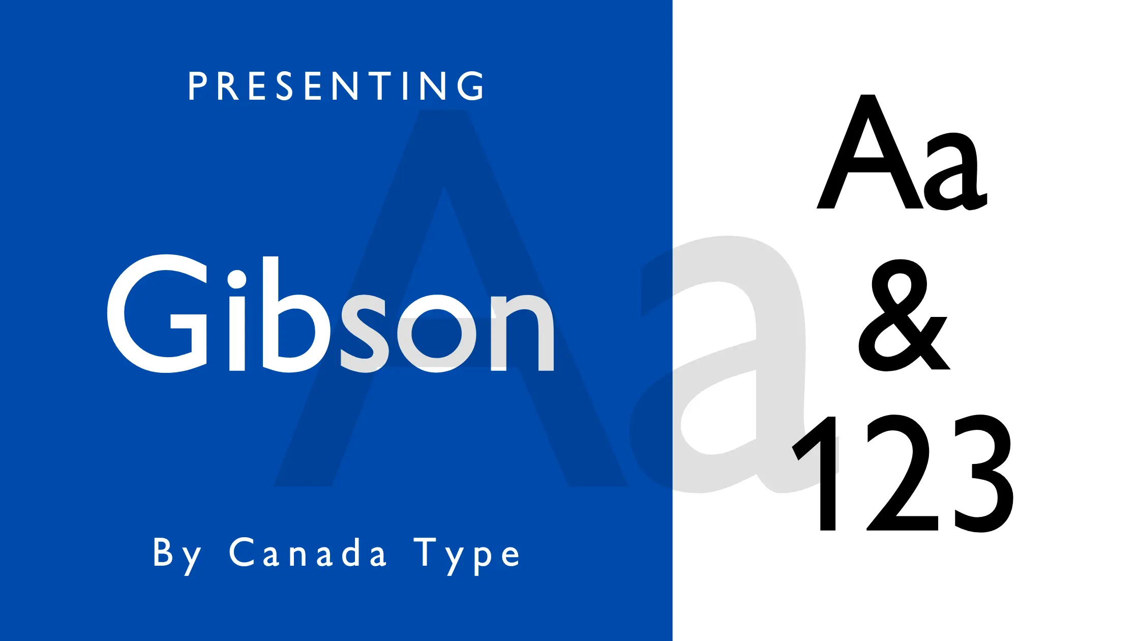
The designer of Gibson Font is widely known to be Rod McDonald, created for the Canadian foundry Canada Type. That background explains some of its character. It has a quiet, functional spirit that suits editorial work, public information, and digital products that value clarity over showiness.
Looking closely at the letterforms, you see gentle curves, open counters, and careful spacing. The rhythm stays even, so long texts feel smooth and readable. The lighter weights feel airy, while the bold weights carry strong hierarchy without looking heavy. One limitation I noticed: in very expressive branding, its neutral mood may feel a bit too polite on its own.
Where Can You Use Gibson Font?
In practical use, I find Gibson Font works well for user interfaces, dashboards, and product websites. On screens, the sans-serif structure keeps text sharp and easy to scan. At medium sizes, like navigation labels and buttons, it stays clear and consistent, which helps interfaces feel stable and well-organised.
For long paragraphs, such as blog posts or reports, the font style holds up well. Body text stays legible at small sizes, especially in the regular and book weights. For headings, I often pair a heavier Gibson weight with more open tracking. It creates a calm hierarchy that still guides the eye without aggressive contrast.
In branding, I like using Gibson Font for modern, honest visual identities aimed at education, tech, non-profit, or civic projects. It also pairs nicely with a more expressive serif or display face for headlines. In those cases, Gibson supports the system as body copy, captions, and UI elements, giving the whole layout a dependable backbone.
Font License
Gibson Font is a commercial typeface, and licence terms can vary by vendor and use. Before you use it in client work, apps, or large-scale branding, always check the latest licence details from the official source to confirm what is allowed for personal and commercial projects.
After testing Gibson Font across several projects, I now see it as a solid, trustworthy choice when I need quiet clarity and balanced typography.


Leave a Reply