

About Gilbert Font
I first tried Gilbert Font while working on a small pride-themed poster series for a local community event. I needed a clean, friendly voice that still felt bold and human. Many geometric sans options looked too cold. This one seemed to strike a more emotional balance, so I gave it a real test on that project.
What drew me in was its story and strong shapes. The letters feel open, simple, and direct, but not boring. I wanted to see how this typeface would behave in colour-heavy layouts and tight grids, so I tested it across headlines, short quotes, and small captions for Free Fonts Lab mockups.
Font Style & Design Analysis
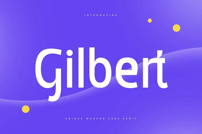
Gilbert Font is a sans-serif typeface with a bold, modern voice. The structure feels geometric at first, but the curves add softness. Strokes look even and confident, and the caps form strong blocks of colour on the page. It gives a sense of clarity and purpose, without sliding into a corporate look.
The font is based on the original Pride type project created to honour Gilbert Baker, the designer of the rainbow flag. Different digital versions exist, so attribution can vary, and in many cases the designer is listed as unknown. What stays consistent is the tribute spirit and the focus on visibility and equality through typography.
Looking closely at the letterforms, I notice wide counters and generous spacing that help legibility at medium sizes. The rhythm of the font family is steady, so lines feel even and easy to scan. Rounded shapes like O and C feel welcoming, while straight stems keep things grounded. Its biggest strength is bold display work; its limitation shows in long body text, where the heavy weight can feel tiring.
Where Can You Use Gilbert Font?
I see Gilbert Font working best in campaigns that need both clarity and heart. Posters, social graphics, banners, and event branding benefit from its strong sans-serif presence. Large sizes really show off the blocky shapes and open counters. At big scales, the colour and form work together to deliver a clear, proud message.
In smaller sizes, I find it holds up well for short labels, UI tags, or call-to-action buttons, as long as you keep enough spacing. I avoid using it for long paragraphs, because the bold weight and tight vertical rhythm become a bit intense on the eyes. For subheadings and pull quotes, however, it gives a firm, confident voice.
When pairing, I like placing Gilbert Font with a softer serif for body copy, or a neutral grotesque for longer text. That contrast lets the display style lead the visual identity without overwhelming the layout. For audiences, it speaks well to social causes, youth projects, LGBTQ+ events, and any brand that wants a clear, inclusive tone.
Font License
Licensing for Gilbert Font can differ between releases, so I never assume permissions. Some versions allow personal and community use, while others may have stricter terms. Before using it in client or commercial work, I always check the official source and read the licence details carefully. For me, Gilbert works best as a statement font, used with intent and respect.
As a designer, my honest view is simple: when I want a bold, inclusive sans-serif voice that carries a story, this is one of the first options I consider.


Leave a Reply