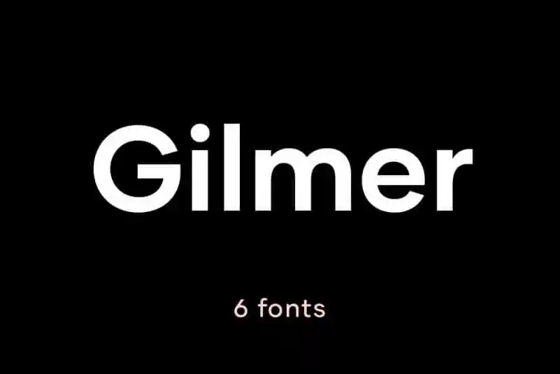
About Gilmer Font
My first reaction to Gilmer Font was simple: it looked clean, calm, and very modern. I wanted a typeface that felt solid without shouting, and Gilmer caught my eye right away. The rounded shapes and tidy lines made me curious to see how it behaved in real layouts.
I tested it on a branding mockup, a pitch deck, and a simple web landing page for a client. Each test helped me see how the font family handled different roles, from bold titles to light body copy. I first noticed it while researching geometric options for a Free Fonts Lab article, and it felt worth a deeper look.
Font Style & Design Analysis
From the first glance, I read Gilmer Font as a geometric sans-serif with a strong modernist flavour. The circles feel close to perfect, and the straight strokes stay very consistent. This gives the typeface a structured, almost engineered tone, which can work well for brands that want a clean and confident visual identity.
As far as I can tell, the exact designer is unknown, or at least not clearly credited in open sources. That said, the work feels considered. The weights line up in a logical range, and the overall font style suggests someone studied classic geometric models before drawing it. The influence of well-known modern typefaces is there, but it does not feel like a direct clone.
When I zoom into the letterforms, I notice a nice balance between strict geometry and small optical tweaks. The counters stay open, so the shapes breathe well on screen. Spacing feels slightly tight in heavier weights, especially around letters like “A”, “V”, and “W”, but nothing that careful tracking cannot fix. At medium sizes, the rhythm reads smooth, but at very small sizes, some strokes start to blend, so I avoid it for dense body text.
Where Can You Use Gilmer Font?
In my projects, Gilmer Font shined most in headings, logos, and short taglines. The geometric style gives titles a clear, sharp edge that stands out on posters, slides, and landing pages. For tech, startup, and product brands, it sends a message of order, simplicity, and focus without feeling cold or distant.
At larger sizes, the characters look strong and even across the line, which is great for hero text and navigation. I used it for section headers in a UI design, and it stayed legible on both desktop and mobile. For long paragraphs, I found it a bit stiff, so I often pair it with a softer sans-serif or a humanist serif to keep reading comfortable.
When I build a layout around it, I like using bold or semi-bold for headings and regular for subheads or captions. Line spacing benefits from a touch more breathing room, especially on dark backgrounds. Paired with a simple colour palette and plenty of white space, the font helps create a clean, geometric visual identity that feels current and easy to scan.
Font License
From what I could gather, the licence terms for Gilmer Font vary across sources, especially between personal and commercial use. I always recommend checking the official licence text before using it in any client work, paid project, or large-scale branding. That small step saves a lot of trouble later, and it keeps our work respectful.
After spending time with Gilmer in real layouts, I see it as a solid option when I need a modern geometric voice without excess flair. It will not solve every typography problem, but used with care, it brings clarity and structure to many digital and branding projects I work on as Ayan Farabi.


Leave a Reply