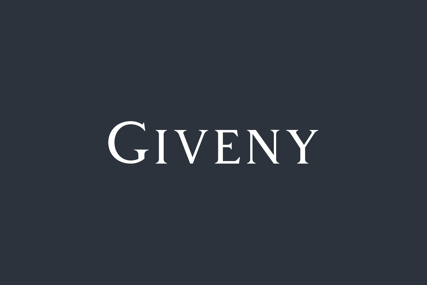
About Giveny Font
I came across Giveny Font while searching for a calm, high-end serif for a beauty brand concept. The client wanted something elegant, but not cold or stiff. I tested several families, yet this one kept pulling me back, mainly because of its soft contrast and balanced shapes.
I first tried it on a simple wordmark mockup for Free Fonts Lab, just to see how it behaved in a clean layout. The uppercase letters held their shape very well, and the gentle curves felt refined without looking overly fancy. That mix of control and warmth made me want to explore it further.
Font Style & Design Analysis
Giveny Font is a serif typeface with a clear focus on elegant, modern forms. The serifs are sharp but not aggressive, which gives the font style a polished, editorial tone. Stroke contrast is present yet soft, so the typeface feels classy without drifting into extreme high-contrast fashion territory.
The designer is unknown, at least from the material I could verify, but the work suggests a careful, restrained hand. Proportions lean slightly condensed, especially in the uppercase, which adds a tall, graceful rhythm. The font family seems built for titles and branding more than dense reading, and the spacing supports that direction.
Looking closely at the letterforms, I notice smooth curves on C, G, and S, and confident verticals on H, N, and I. The spacing is fairly tight by default, giving headlines a strong, cohesive block of typography. It holds up nicely at medium sizes, but very small text can lose clarity, especially in thinner strokes. Used as a display serif with some air around it, it sets an assured, upscale mood.
Where Can You Use Giveny Font?
I see Giveny Font working well in branding for beauty, fashion, lifestyle, and boutique hospitality. It has that quiet luxury feel many clients ask for now. On packaging, it shines in product names, small taglines, and structured label layouts, where the serif details can breathe and add character.
At large sizes, like magazine covers, hero banners, or posters, the serif shapes feel confident and controlled. The typeface also handles logotypes nicely, especially when you track the letters a bit wider. For body text, it is usable for short sections, but I would not choose it for long-form reading, as the rhythm suits headings more.
In terms of pairings, I like it alongside a clean sans-serif for body copy, something neutral that does not fight for attention. A simple geometric or humanist sans keeps the visual identity tidy and modern. For more expressive layouts, a light script accent can work, as long as Giveny Font stays the main structural anchor.
Font License
The licence terms for Giveny Font can vary depending on where you obtain it and which version you use. Before using it in client work, commercial branding, or products, always read the official licence details on the original source and make sure the permissions fit your project.
My personal takeaway as Ayan Farabi: I reach for this serif when I want a refined, modern voice that does not shout. It rewards careful sizing and spacing, and when treated with respect, it gives brand work a gentle, confident presence.


Leave a Reply