

About Gladiator Font
I first reached for Gladiator Font while working on a bold poster concept that needed a strong, heroic mood. I wanted a typeface that felt tough and cinematic, but still readable from a distance. The name alone caught my eye, yet it was the heavy shapes and sharp edges that made me stop and test it.
As I explored it further for Free Fonts Lab, I focused on how it behaved in real layouts, not just pretty previews. I checked how the font family handled short headlines, stacked titles, and tight spacing. My aim was simple: see if it could bring power to a design without turning everything into noise.
Font Style & Design Analysis
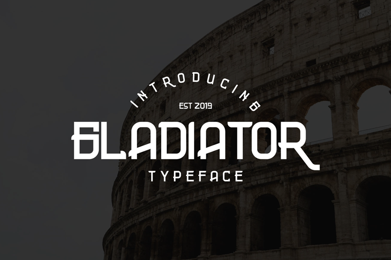
Gladiator Font is a bold display typeface built for impact, not quiet reading. The letters feel wide, heavy, and almost carved, like marks cut into stone or metal. Angles are strong, counters are tight, and the font style pushes your eye straight to the headline. It clearly wants to shout, not whisper.
As far as I could confirm, the designer unknown detail still stands, which makes it a bit tricky when you want background or design notes. Without a credited foundry, I had to rely only on what I saw in the actual letterforms and how they behaved inside grids and real layouts.
The letterforms have thick strokes, compressed curves, and a slightly condensed feel, which gives strong rhythm in short words. Spacing is tight by default, so large titles look solid and unified, but longer lines can start to feel cramped. The mood is aggressive and dramatic, with clear strength in posters and logos, but limited use in body copy or subtle branding.
Where Can You Use Gladiator Font?
I found Gladiator Font works best when you keep text short and bold. Think game covers, sports graphics, film titles, event posters, or any visual identity that needs a rugged, battle-ready tone. At large sizes, the display shapes feel confident and clear, even from a distance.
In smaller sizes, the tight spacing and dense forms start to merge, so I would avoid it for long captions or UI text. I had better results using it for one or two punchy words, then pairing it with a clean sans-serif for supporting text. This mix keeps the energy in the headline while the rest stays readable.
For audiences into gaming, metal music, action content, or historical battle themes, this typeface lands in the right zone. It suits merchandise, logo lockups, banners, and thumbnail designs. Because it is a display font, I treat it like a visual effect: strong, memorable, but used carefully and with plenty of breathing space around it.
Font License
Licensing for Gladiator Font can vary depending on the source, and terms may change over time. I always recommend checking the official licence details before using it in commercial projects. For personal use or client work, confirm rights, restrictions, and any attribution needs directly from the original provider.
For me, Gladiator Font is a focused tool: great when a design needs raw strength, as long as I keep the message short and the layout disciplined.


Leave a Reply