
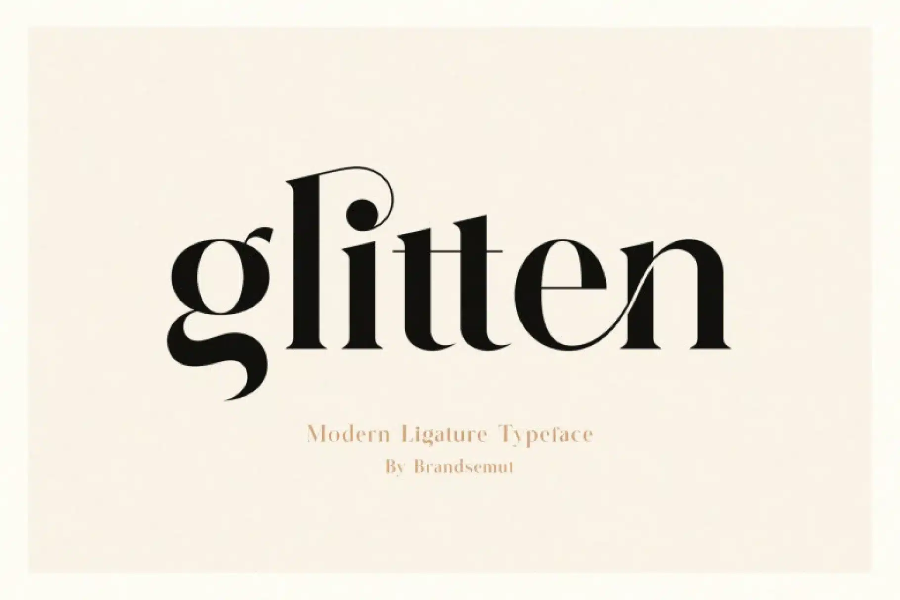

About Glitten Font
I first tried Glitten Font while working on a book cover that needed a calm, classic mood. The brief asked for something elegant, readable, and slightly romantic, without going full script. I wanted a serif that felt soft, but not old-fashioned or stiff.
While browsing options for Free Fonts Lab, Glitten caught my eye because of its gentle curves and clear structure. I tested it in headings, pull quotes, and short paragraphs to see how it behaved in real layouts. It looked promising, so I spent time pushing it in different colour palettes and image-heavy designs.
Font Style & Design Analysis
Glitten Font is a serif typeface with a smooth, almost creamy flow to its shapes. The serifs are noticeable but not sharp, which gives the font a relaxed, approachable feel. It sits somewhere between classic book typography and modern brand display, so it can support both quiet and expressive layouts.
The designer is unknown, at least from the sources I could verify with confidence. That said, the work shows a clear understanding of contrast and rhythm. There is a sense that Glitten was drawn with display work in mind first, then adapted for shorter text use.
The letterforms have soft curves, a moderate contrast between thick and thin strokes, and fairly generous spacing. This spacing helps the font breathe, especially in titles and logos. In longer text blocks, the open rhythm reads well up to a point, but I would not set very long pages in it. Glitten works best for headings, subheadings, pull quotes, and short editorial sections rather than dense body copy.
Where Can You Use Glitten Font?
I see Glitten Font working well in branding for beauty, lifestyle, and boutique products. Its serif structure feels trustworthy, while the soft curves add warmth. On posters or social media graphics, large titles in Glitten carry a gentle, confident voice that suits calm, thoughtful messaging.
At medium sizes, like magazine subheads or website hero text, the font style keeps its charm and stays clear. The rhythm between letters remains stable, so you do not get awkward gaps. For long paragraphs, I would pair Glitten with a simpler serif or a clean sans-serif font family, keeping Glitten for key phrases or section titles.
On smaller screens, Glitten holds up in short lines, but the subtle stroke contrast can feel a bit soft at tiny sizes. Because of this, I would avoid using it for mobile body text. It feels most comfortable in editorial layouts, invitations, packaging, book covers, and gentle luxury branding, where you can give the letterforms enough space to breathe.
Font License
Licensing for Glitten Font may differ between personal and commercial use, and terms can change over time. I always recommend checking the official source before using it in client work or large projects, and keeping a copy of the licence for your records.
For me, Glitten is a pleasant serif to reach for when I need something soft, readable, and slightly romantic, without losing structure or clarity.


Leave a Reply