
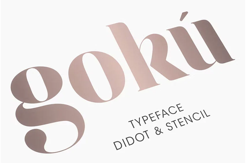

About Goku Font
I first tried Goku Font while working on a poster that needed strong, bold energy but still felt readable. I wanted something that hinted at anime drama, yet did not look childish or messy. The name caught my eye first, but the structure of the letters kept me interested.
I tested it across a few layouts for Free Fonts Lab, mainly display headlines and short taglines. The font gave me a sharp, focused mood that worked well for action themes. It looked confident on screen and print, so I decided to spend more time exploring how flexible it really was.
Font Style & Design Analysis
Goku Font is a serif typeface, and that choice shapes its whole personality. Each letter has clear, sharp serifs that feel almost like small blades. The overall font style leans towards strong, angular forms, which fits the bold, battle-ready name. It feels dramatic, but it still stays surprisingly disciplined on the page.
The designer is unknown, which is a shame, because there is a clear vision behind this font family. The spacing and curves show someone who understands balance and tension in typography. It does not feel like a rushed fan project. Instead, it looks like a careful attempt to capture anime intensity in a controlled serif structure.
The letterforms have tight, compact proportions, with sturdy vertical strokes and slightly condensed shapes. This gives headlines a dense, powerful rhythm. The spacing is snug, so words look solid and unified, not airy. That works well for titles, but long paragraphs can feel heavy. As a serif font, it carries a sense of seriousness, yet the sharp angles add a playful, heroic edge. It shines in short text, logos, and graphic compositions, but it is not ideal for long reading passages.
Where Can You Use Goku Font?
In my tests, Goku Font worked best in large display sizes, like posters, thumbnails, and bold website headers. At big sizes, the serif details and dramatic angles really stand out. On streaming covers or gaming banners, it delivers that strong, heroic voice many clients ask for.
At smaller sizes, some of the finer shapes start to blend, especially on low-resolution screens. For body copy, I would avoid this serif and use a calmer companion typeface. It pairs well with a simple sans-serif for text, letting Goku Font stay in the hero role for titles, logos, and short phrases.
I can see it fitting anime fan art, e-sports branding, action movie key art, and bold youth campaigns. If your visual identity needs drama and power, this font style can amplify that mood quickly. Just keep the text short, give it space, and avoid cramming too many words into one line.
Font License
The licence for Goku Font can change depending on where you download it. Some sites allow personal use only, while others might offer wider rights. I always recommend checking the official source carefully before using it in any commercial project or paid client work.
For me, Goku Font is a fun, focused serif that I now keep in my toolkit for bold, anime-inspired titles and energetic poster work.


Leave a Reply