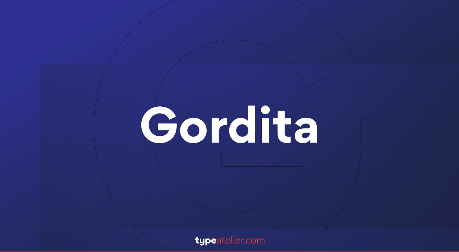
About Gordita Font
I first reached for Gordita Font while working on a quiet, modern brand for a small tech studio. They wanted something clean, but not cold. I needed a typeface that felt simple, honest, and human, without any fussy details or trendy tricks that would age too fast.
I had seen Gordita mentioned a few times while browsing type reviews for Free Fonts Lab, so I set aside an afternoon to test it properly. I tried it in logos, app screens, and a short brand guide. What kept me with Gordita was how relaxed it looked, even when the layout felt strict and grid-based.
Font Style & Design Analysis
Gordita Font is a sans-serif typeface with a calm, geometric base and soft, rounded finish. The shapes feel rooted in classic modernist design, but there is a gentle warmth in the curves. You get the structure of a geometric font, yet it avoids that stiff, mechanical look many similar faces fall into.
The designer is often linked to a contemporary digital foundry, though in many bundles the designer is unknown or not clearly credited. From my experience, the work behind it feels very intentional. The family looks carefully drawn and tested, with a focus on digital use and clear on-screen reading, rather than print-only nostalgia.
The letterforms have open counters, especially in a, e, and s, which helps legibility at small sizes. Spacing is quite even, with a steady rhythm that works well in both titles and body copy. The mood sits between friendly and professional, never shouting for attention. Its strength is balance: enough personality to avoid feeling generic, yet neutral enough to support many visual identities. The main limitation is that it can feel too polite for loud, expressive poster work.
Where Can You Use Gordita Font?
In real projects, Gordita Font has worked best for digital branding, product interfaces, and simple editorial layouts. On screens, its sans-serif clarity really helps. At larger sizes, like hero titles or section headings, the curves feel smooth and confident, while still leaving space for images and colour to lead the design.
At small sizes, such as app menus, captions, and long UI labels, the open shapes and steady spacing stay readable. I have used it in style guides, slide decks, and design systems where consistency matters. It suits tech brands, creative studios, and lifestyle products that want a modern but approachable voice.
For pairing, I like Gordita with a sharp serif for headlines, or with a contrasting display font for special words and short tags. Inside a single layout, using different weights of the same font family keeps things tidy. Gordita Font is flexible enough to handle both quiet body text and modest titles without fighting for attention.
Font License
Licensing for Gordita Font can vary between sources, so I never assume what is allowed. Before using it in client work or any commercial project, I always check the official licence details. Make sure you confirm rights for desktop, web, and app use, as each might need a separate licence.
My honest takeaway as Ayan Farabi: Gordita has become a steady, low-drama choice in my toolkit, especially when a project needs clarity, warmth, and long-term reliability.


Leave a Reply