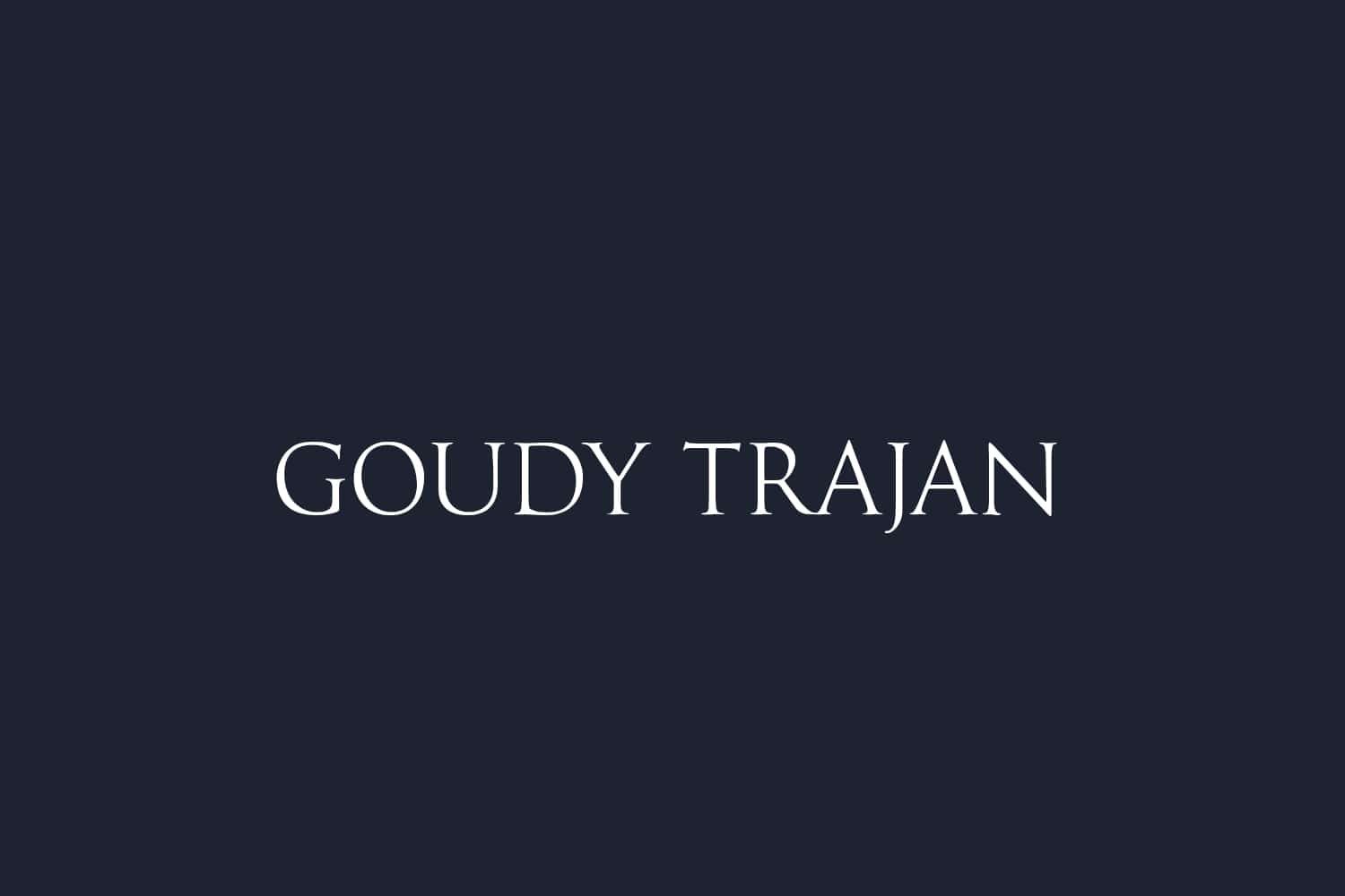
About Goudy Trajan Font
I first reached for the Goudy Trajan Font while working on a classic book cover that needed quiet authority. The project called for something timeless, yet not stiff or cold. I wanted a typeface that could suggest history, craft, and respect without feeling heavy-handed or dramatic.
As I tested options for Free Fonts Lab, this font stood out for its calm presence. The proportions felt steady, and the details looked carefully shaped. I decided to use it in headings and chapter titles to see how it behaved in a real layout, both in print proofs and on screen mock-ups.
Font Style & Design Analysis
This is a serif typeface with a clear classical voice. The letterforms draw from Roman inscription styles, with tall, dignified shapes and balanced widths. The serifs are firm but not overly sharp, which keeps the font approachable. It carries a traditional tone that feels serious, but not overly formal or ceremonial.
The original Goudy Trajan Font concept is linked to Frederic W. Goudy, whose work often blends warmth with historical reference. Many digital versions interpret his ideas, so quality can vary from one font family to another. In my tests, I treated this as a respectful revival, not a strict historical reconstruction, and judged it on visual performance instead of purity.
The uppercase forms are the main event here, with generous curves and clear interior spaces. Spacing is fairly tight by default, so I often add a bit of tracking for titles. The rhythm feels steady and measured, which helps in centred layouts. It works best when you give it room to breathe. For small text, the fine details and contrast can become less clear, so I keep it for display sizes and short passages rather than dense body copy.
Where Can You Use Goudy Trajan Font?
I find the Goudy Trajan Font most at home in projects that need a sense of heritage or ceremony. It suits book covers, academic titles, museum graphics, and formal event materials. On posters or signage, the capitals feel confident without shouting. It speaks to audiences who value tradition, culture, and careful design.
At large sizes, the serif details and classical proportions really shine. The strokes feel strong, and the letterforms keep their clarity even on textured backgrounds. At medium sizes, such as subheadings or pull quotes, it still performs well if you manage line spacing. For very small text, though, I prefer a simpler serif with lower contrast, as this one can look a bit fragile.
For pairing, I often match it with a clean sans-serif for body text to keep layouts readable and modern. A neutral geometric or humanist sans creates a nice balance between old and new. In visual identity work, this typeface can become the hero for logos, seals, or wordmarks, while a simpler companion handles long copy and digital interfaces.
Font License
The licence for the Goudy Trajan Font can change depending on the source and digital version you use. Some releases allow personal work only, while others may include commercial rights. Always read the official licence carefully before using it in client projects, branding, or paid products.
As a designer, I now reach for this typeface when I need calm, classical strength without visual noise. Used with care and space, it can add real depth to a design.


Leave a Reply