
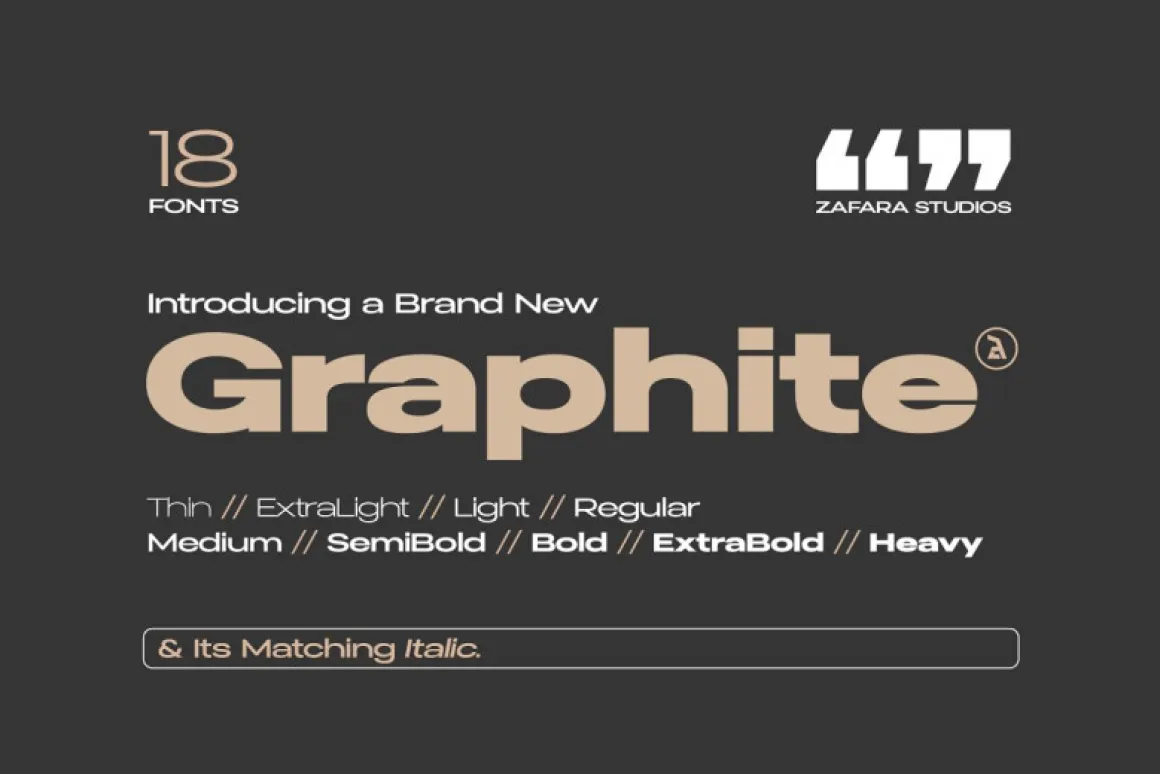

About Graphite Font
I came across Graphite Font while looking for a clean, modern typeface for a simple tech case study. I needed something neutral, but not cold. The first thing that caught my eye was the calm, balanced look of its shapes. It felt practical, yet still friendly.
I decided to test it in a full presentation deck and a few web layouts for Free Fonts Lab. I wanted to see how this font family behaved with long text, small labels, and large headings. My goal was to check if it could handle real project pressure without drawing too much attention to itself.
Font Style & Design Analysis
Graphite Font is a clean sans-serif typeface with a very controlled, modern tone. The design leans towards a geometric feel, but it does not look stiff. Strokes stay even, counters are open, and the whole font style aims for clarity. It sits somewhere between strict corporate and relaxed digital product design.
The exact creator of this typeface is designer unknown, which makes it a bit harder to trace its design roots. That said, the construction feels thoughtful. The proportions show care, and the visual decisions make sense on screen. It reminds me of workhorse UI fonts that focus on usability first and personality second.
The letterforms have smooth curves, clear terminals, and a steady rhythm from word to word. Spacing feels slightly generous, which helps readability at smaller sizes. In larger headings, the shapes hold up well, without awkward angles or strange details. Its strength lies in quiet support roles: interfaces, captions, and clean layouts. If you want high drama or strong character, this sans-serif font family may feel a bit too reserved.
Where Can You Use Graphite Font?
I see Graphite Font working very well in digital products, dashboards, and web apps. The neutral sans-serif style makes it a safe choice for user interfaces and body text. At medium sizes, buttons, menus, and labels stay clear and easy to scan. It does not fight with icons or colour.
For branding, it can fit start-ups, tech services, and utility tools that want a modest visual identity. It pairs nicely with a warmer serif for headings, or a bold display font for hero titles. In print, it handles reports, simple brochures, and instruction sheets quite well, as long as you keep enough line spacing.
At large sizes, such as section headers or slide titles, Graphite Font still looks balanced, but you might want to track it slightly tighter. For very small text, like footnotes or dense tables, test it carefully; the open letterforms help, yet extreme reductions can make it feel a bit light. I like using it when I need typography that supports the content and quietly steps back.
Font License
The licence for Graphite Font can change depending on the source, so treat it with care. Always check the official licence details before using it in client projects, apps, or commercial work. For personal experiments or mockups, verify what is allowed so your design process stays safe and responsible. For me, it is a calm, dependable option when I need a quiet, modern voice in my layouts.


Leave a Reply