
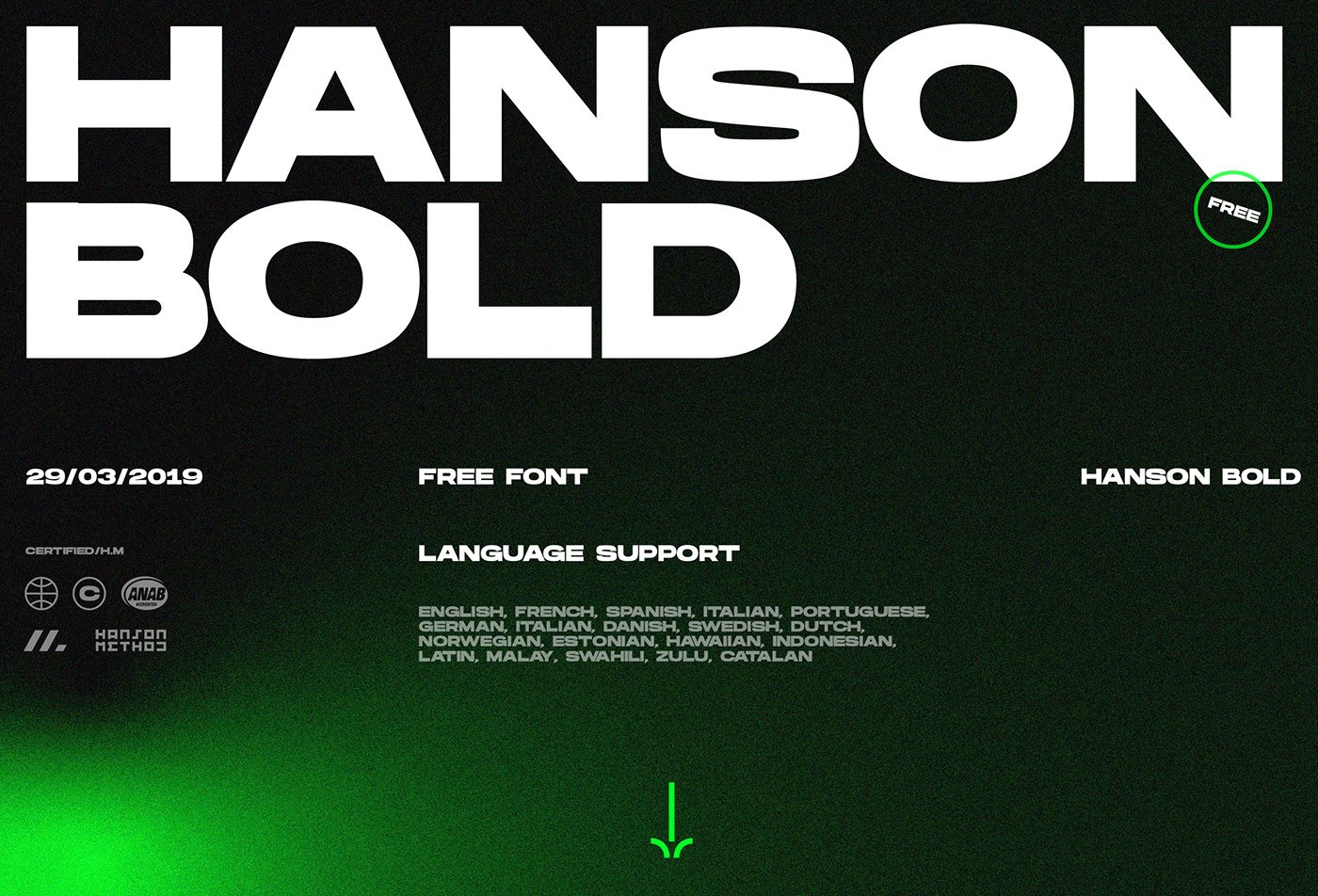

About Hanson Font
I first picked up Hanson Font while working on a bold sports poster that needed strong, clear type. I wanted something tough, simple, and easy to read from far away. Hanson Font kept popping up in my research, so I downloaded it and started testing it in a few layout drafts.
What drew me in was its heavy weight and clean lines. It looked tight and confident without feeling messy or overdone. I tried it on headlines, numbers, and short labels, and it held up well each time. For Free Fonts Lab, I later ran a few more structured tests to see how it behaved across different sizes and colour schemes.
Font Style & Design Analysis
Hanson Font is a bold sans-serif typeface with a strong, blocky presence. The design feels very geometric at first, but there are subtle optical tweaks that make it more usable than a pure grid-based face. The overall font style leans towards impact and clarity rather than elegance or softness.
The exact designer is unclear, so I would mark it as designer unknown in my notes. That said, the typeface clearly follows the tradition of athletic and urban display fonts used in sports branding, e-sports, and gaming covers. You can see hints of poster typography used in action movies and streetwear labels.
The letterforms are wide and heavy, with tight spacing that creates a dense rhythm in headlines. Vertical strokes feel thick and stable, while corners tend to be sharp rather than rounded. This gives the font family a very firm, no-nonsense tone. It shines in all-caps settings but feels less flexible for long text. At small sizes, counters start to close up a bit, so I would not use it for body copy or detailed UI text.
Where Can You Use Hanson Font?
In my testing, Hanson Font worked best in big, loud settings. Think posters, sports graphics, covers, banners, and bold social media titles. When used large, each letter reads clearly, and the sans-serif structure helps keep the typography from feeling dated. I also tried it on jersey numbers and team names, and it fit that language very well.
At medium sizes, such as subheadings or short callouts, it still performs nicely as long as you give it enough breathing space. I usually increase tracking slightly when working with longer words. It pairs well with a simple, neutral sans-serif for body text, or with a light serif for contrast in more editorial layouts.
For smaller sizes, especially under 12pt, Hanson Font begins to lose a bit of clarity because of its heavy strokes. I would keep it for display roles only. It suits audiences who like bold, modern, and sporty design: e-sports teams, gyms, streetwear brands, music events, and strong personal branding. Used with clean grids and simple colour schemes, it can anchor a visual identity quite effectively.
Font License
Before using Hanson Font in any client or commercial project, I always check the current licence details from the original source. Terms can change over time, so do not assume that personal or commercial use is always allowed. Take a moment to confirm usage rights, especially for logos and large campaigns.
My personal takeaway as Ayan Farabi: I reach for Hanson Font when I need loud, confident type that grabs attention fast, as long as I keep it in short, focused display roles.


Leave a Reply