

About Heavitas Font
I came across Heavitas Font while working on a bold poster series for a local event. I needed a typeface that felt heavy, loud, and confident, but still clean enough to sit in a modern layout. Many display options looked messy or overstyled, so this one caught my eye quickly.
The strong shapes and compact feel made me curious, so I tested it in a few mock-ups and then in a real client draft for Free Fonts Lab. I wanted to see how it behaved in different sizes, colours, and layouts before trusting it for final artwork.
Font Style & Design Analysis
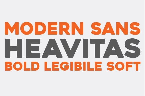
Heavitas Font is a sans-serif typeface with a very bold, blocky voice. The letters feel almost carved, with thick strokes and tight counters that push a lot of weight onto the page. It sits firmly in the display space, built to shout rather than whisper. Every line looks intentional and strong.
From what I could find, the designer is unknown, and there is not much official story behind the font family. That lack of background did not stop me from testing it. Instead, I focused on how it actually performs in layouts, rather than any branding story or marketing pitch around it.
The letterforms are wide and heavy, with very little contrast between thick and thin strokes. Spacing is tight, so words form solid visual blocks, which works best for short text. The rhythm feels punchy and energetic, but it can look cramped if you set long headlines without tracking. As a sans-serif, it keeps details simple, so curves and diagonals stay clear, yet the compact counters can blur at very small sizes.
Where Can You Use Heavitas Font?
I find Heavitas Font most useful in big, bold settings where you want impact fast. Think event posters, music covers, sports graphics, and strong social media banners. It suits brands or projects that lean into power, energy, or statement-led typography. It is not shy, and it demands attention right away.
At large sizes, the heavy shapes and sharp edges really shine, especially in all caps. The typeface locks nicely into grid-based layouts, where you can align text blocks with images and strong colour fields. For body copy or long paragraphs, it feels too dense, so I avoid it there and keep it for titles, labels, and short phrases.
In terms of pairing, I usually match this font with a light or regular-weight sans-serif with open counters, to give breathing room. A simple neutral font family in the body copy helps balance the weight of the headlines. For younger or more urban audiences, bold colour palettes and tight, stacked layouts work well with its solid, geometric mood.
Font License
The licence for Heavitas Font can vary depending on where you download it. Some sources allow personal use, while commercial projects may need a paid or special licence. I always recommend checking the current licence details on the official source before using it in client work or large campaigns.
My honest takeaway as Ayan Farabi: I reach for Heavitas Font when I need loud, simple strength in a heading, and I leave it aside when I need softness, nuance, or long reading comfort.


Leave a Reply