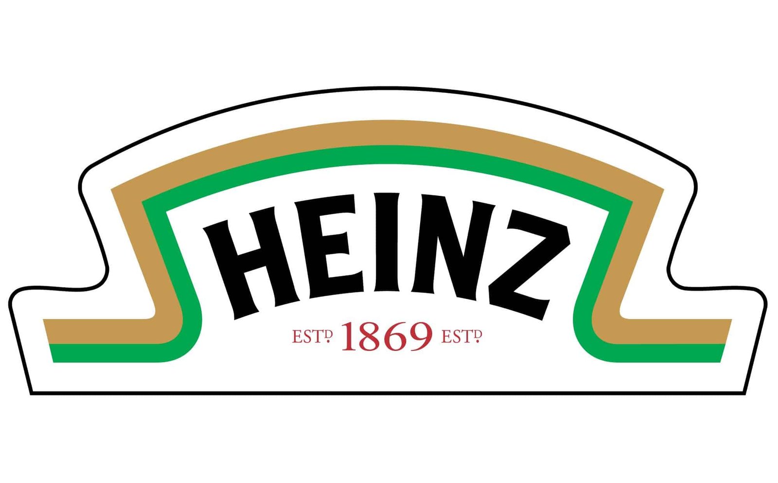
About HeinzLabel Font
I came across HeinzLabel Font while working on a food packaging concept that needed a bold, confident badge. I wanted something that felt branded, but not too polished. I was looking for a strong Heinz Font-style look without copying it directly.
The chunky curves and shield-like shapes caught my eye straight away. It felt familiar, like a classic grocery shelf logo, yet still flexible enough for fresh work. I decided to test it in a few mock brands for a case study on Free Fonts Lab, focusing on how it behaves inside tight logo systems and label layouts.
Font Style & Design Analysis
HeinzLabel Font is a logo typeface aimed at bold wordmarks and emblem designs. The general shape feels compact and sturdy, with letters forming a strong block of colour. It leans into that vintage packaging mood, where typography carries most of the visual identity instead of heavy illustration.
The designer is unknown, which makes it a bit harder to trace its original intent. Still, the font family clearly borrows cues from classic food branding and heritage label typography. It sits in that space between playful and serious, which is often where successful logo work lives. The unnamed origin almost helps, because it feels more like a flexible tool than a signature artist piece.
The letterforms are wide, with rounded corners and controlled contrast. Counters stay open enough for quick reading at mid sizes, though not tiny text. Spacing is fairly tight by default, which works well for badges, but I found myself loosening tracking a touch for longer names. The mood is friendly, grounded, and a bit nostalgic. Its biggest strength is logo clarity; its limitation is body copy, where the rhythm becomes heavy and tiring.
Where Can You Use HeinzLabel Font?
In my tests, HeinzLabel Font worked best for logo wordmarks, label headers, and bold packaging callouts. It feels built for logo work first, then short display lines second. I used it for mock ketchup and sauce brands, but also for a small coffee-roaster concept, and it still held its own.
At large sizes, the typeface looks solid and confident, especially on curved banners or shield shapes. The chunky letterforms carry screen and print well, from posters to simple signage. At smaller sizes, especially below 10–11pt, it starts to lose sharpness and feels cramped. I would not use it for ingredient lists or long paragraphs.
For layout and pairing, I had good results matching it with a clean sans-serif for body text, and sometimes a light script for small accents. The bold logo presence of HeinzLabel Font pairs nicely with minimal layouts and simple colour blocks. It suits food brands, retro-style shops, farmers’ markets, and casual hospitality projects where warmth and familiarity matter more than strict modern minimalism. It can also support digital branding, as long as you keep it for headings and hero text.
Font License
The licensing terms for HeinzLabel Font can change, and they may differ between personal and commercial use. I always recommend checking the official source for the latest licence details before using it in client work or paid projects. Treat it with the same care you give any commercial asset.
My personal takeaway: HeinzLabel Font is a handy choice when I need a strong, familiar logo voice that nods to classic packaging without feeling like a strict copy.


Leave a Reply