

About Hello Headline Font
My first reaction to Hello Headline Font was simple: this thing wants attention. The name felt bold, and the shapes backed that up. I was working on a set of poster layouts for a small event series and needed a display face with impact but not too much fuss.
What pulled me in was the way the letters sit together. They look loud, yet still readable. I tested it inside a few hero banners and social graphics for a client project I later wrote about on Free Fonts Lab. That test run showed me where the typeface shines and where it needs a bit more care.
Font Style & Design Analysis
From my perspective, this is a pure display headline typeface. The whole font family feels built for posters, covers, and big titles. It carries a strong, poster-style voice, almost like old-school print ads, but with a cleaner finish. I would not use it for running text, only for short, punchy lines.
The designer unknown note makes it a little tricky to track the full story behind the font. Still, the design decisions feel intentional. You can sense that someone aimed squarely at modern headline typography rather than general-purpose use. It looks like a font made for visual identity moments, not quiet background roles.
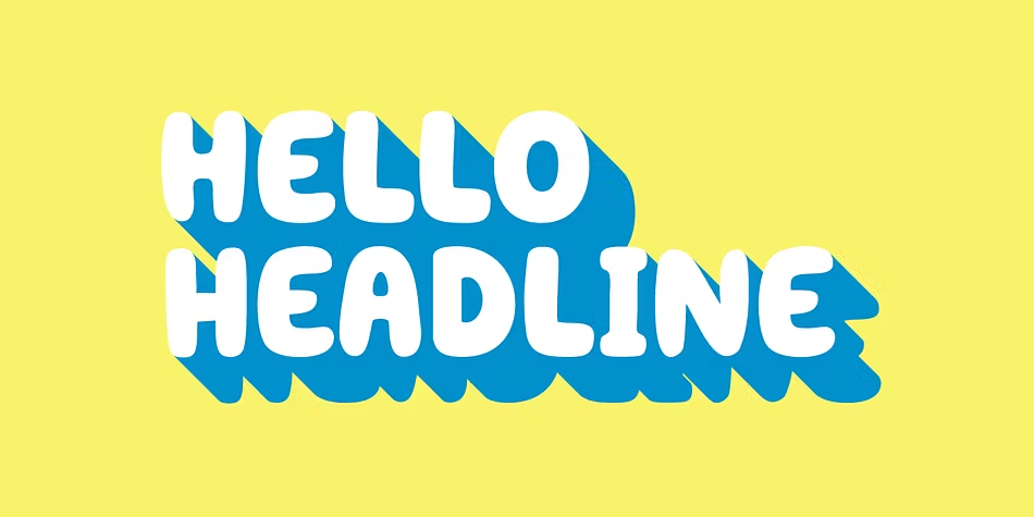
Looking closely at the letterforms, I noticed sturdy strokes, tight shapes, and a compact rhythm across the words. Spacing runs on the tighter side, which adds energy but can cause crowding in longer phrases. It sets a strong mood: bold, direct, and slightly aggressive. That same strength can be a limit, though, if you need softness or a more neutral tone.
Where Can You Use Hello Headline Font?
In real projects, I found Hello Headline Font works best at large sizes. Think posters, YouTube thumbnails, web hero sections, banners, and editorial covers. It can punch through busy artwork and still stay readable. When you give it space around the text, the display character really comes alive.
On the other hand, smaller text sizes expose its limits very quickly. The bold shapes and tight spacing make body text tiring to read. For UI labels, captions, or longer paragraphs, I always switch to a calm sans-serif partner. A clean geometric typeface pairs nicely and lets this headline style stay in the spotlight where it belongs.
For audiences, I see it fitting youth brands, event graphics, music covers, and bold campaign slogans. It suits projects that want confidence and clarity more than elegance. In layout work, centring short lines or stacking words in tall blocks works well. I often increase letter spacing a bit, which opens the typography and keeps the display impact without feeling cramped.
Font License
Licence terms for Hello Headline Font can vary, so I never assume anything. Some sources allow personal use, while commercial projects may need a paid licence. Before you use it for client work, branding, or products, always check the official licence details from the original source and keep a copy on file. That habit has saved me more than once as a working designer.
After spending time with this font in real layouts, my takeaway as Ayan Farabi is clear: it is a strong, focused display tool. When I treat it as a headline specialist, not a do-everything typeface, it rewards me with bold, clear results and a confident voice.


Leave a Reply